Photo credits to Tony Flexii at The Tony Flexii
FREELANCE, REBRANDING
Graphic Designer ▪️ Illustrator, Photoshop, Sketch
Graphic Designer ▪️ Illustrator, Photoshop, Sketch
MISSION:
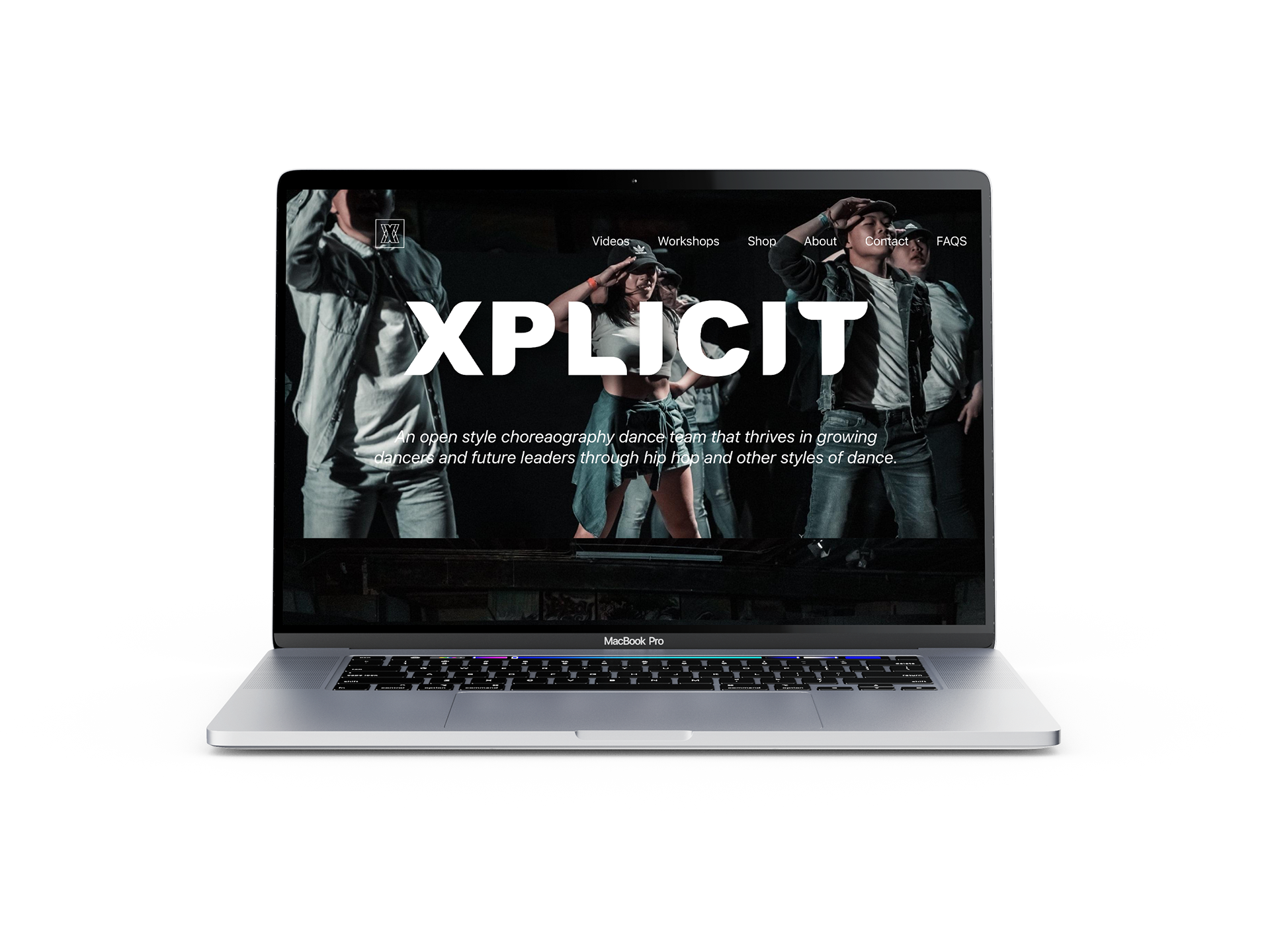
I was approached by one of the co-directors to help with rebranding. Xplicit (formerly known as The FamRaz Dance Team) was in the process of transitioning leadership.
Xplicit directors wanted to emphasize their advocacy for "creativity and staying true to yourself". Xplicit is a wordplay of "explicit: an adj. meaning for 'fully revealed or expressed without vagueness, implication, or ambiguity: leaving no question as to meaning or intent; stated clearly and in detail'".
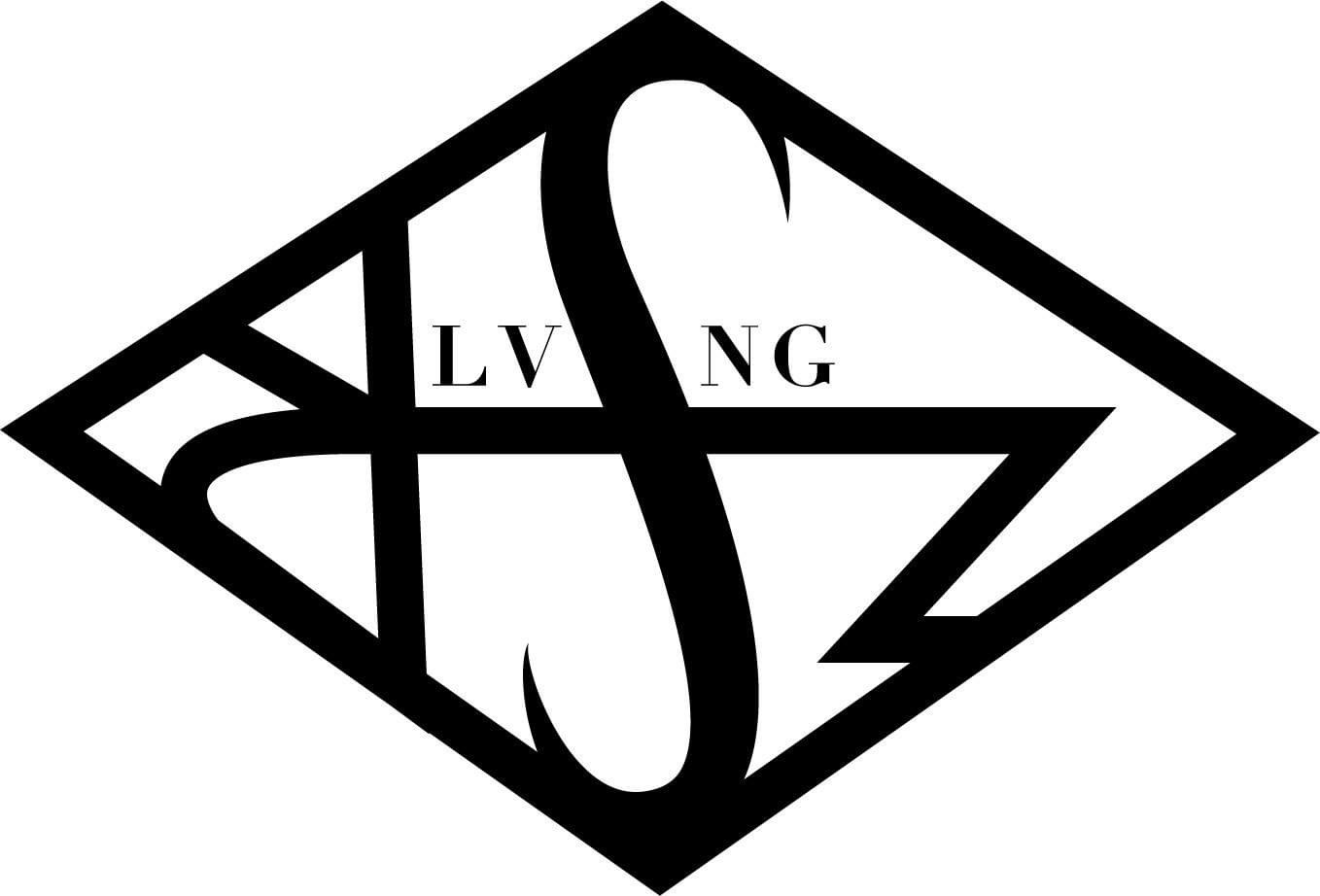

The FamRaz Dance Team logo, Xplicit logo
DESIGN IDEATION:
Given full creative control, I asked the directors to create a word bank of the "feel" they wanted in the logo. I asked "what do you want to capture?", "what do you think of when you hear 'Xplicit'?", this ignited the art direction for the rebrand.
My initial sketches were combinations of gestural and continuous line drawings. This is a technique I use to get my juices flowing and to get rid of more common ideas.
With so much control, it is easy to influence my own biases into the design, so it was important for me to communicate with the directors in order to bounce ideas back and forth.
WORD BANK:
Tough, Edgy, Transparency, Expressive, Motion
Tough, Edgy, Transparency, Expressive, Motion
GOAL:
The goal of the logo design was to showcase movement, precision, and teamwork. I chose to highlight the letter "X" because of its ability to shift from a letter form to a stand alone shape.
In consulting with Xplicit dance directors, they expressed the need for both web and print deliverables.
With this in mind, I chose to use a san-serif font to display clarity and confidence but also to achieve a timeless and fluid design.
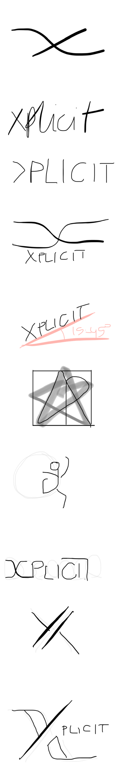
Early ideation stages.
FINAL DESIGN:
The final logo design displays a strong and confident "X" figure that is followed by other "X" figures. The story I wanted to tell in this design is of teamwork and strength.
I watched some of Xplicit's (formerly known as the FamRaz Dance Team) dance videos and found a common theme in this triangular formation in their choreography. I thought it was cool to display that theme in the final design.
Also, when you look at the "X" as a whole, you are still met with a fatter-looking "X", this introduces the work mark for Xplicit. This small ode to optical illusion creates an interesting piece that does not take away from its identity of being the letter "X".
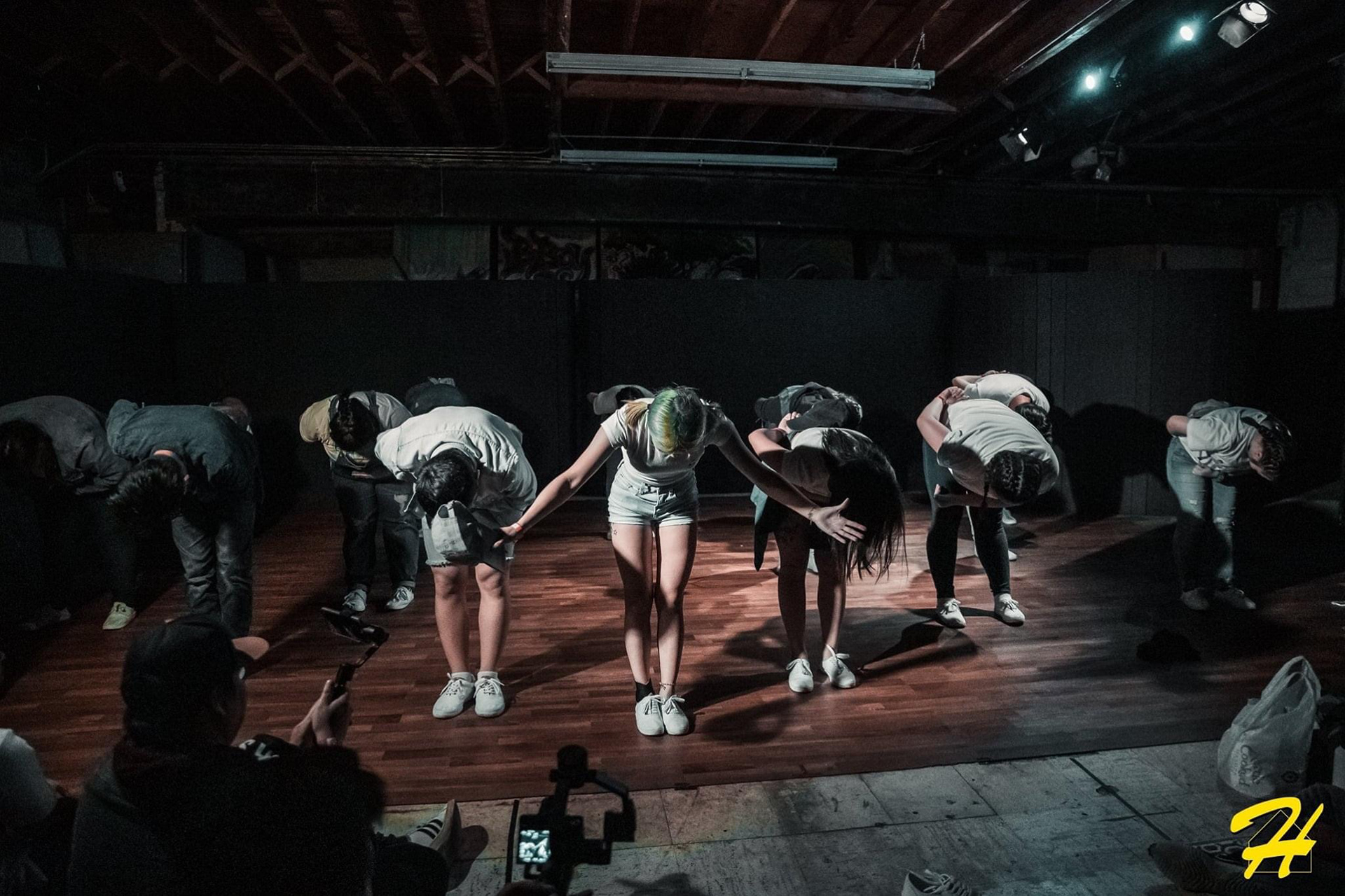
Photo credits to Tony Flexii at The Tony Flexii


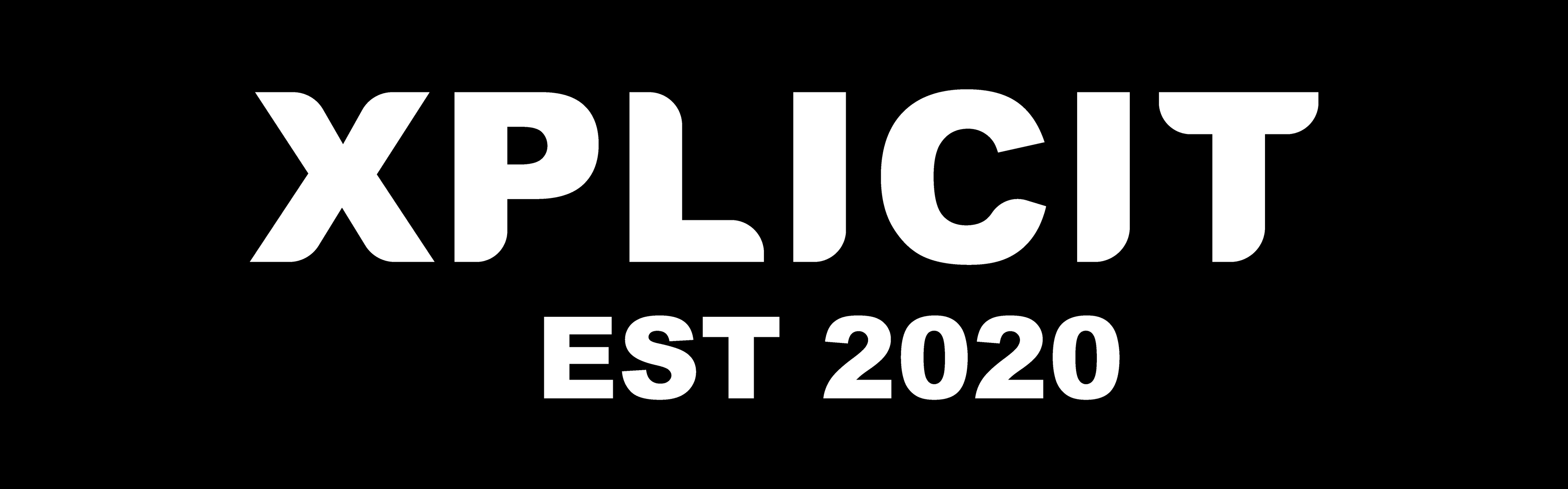
Final Logo Design
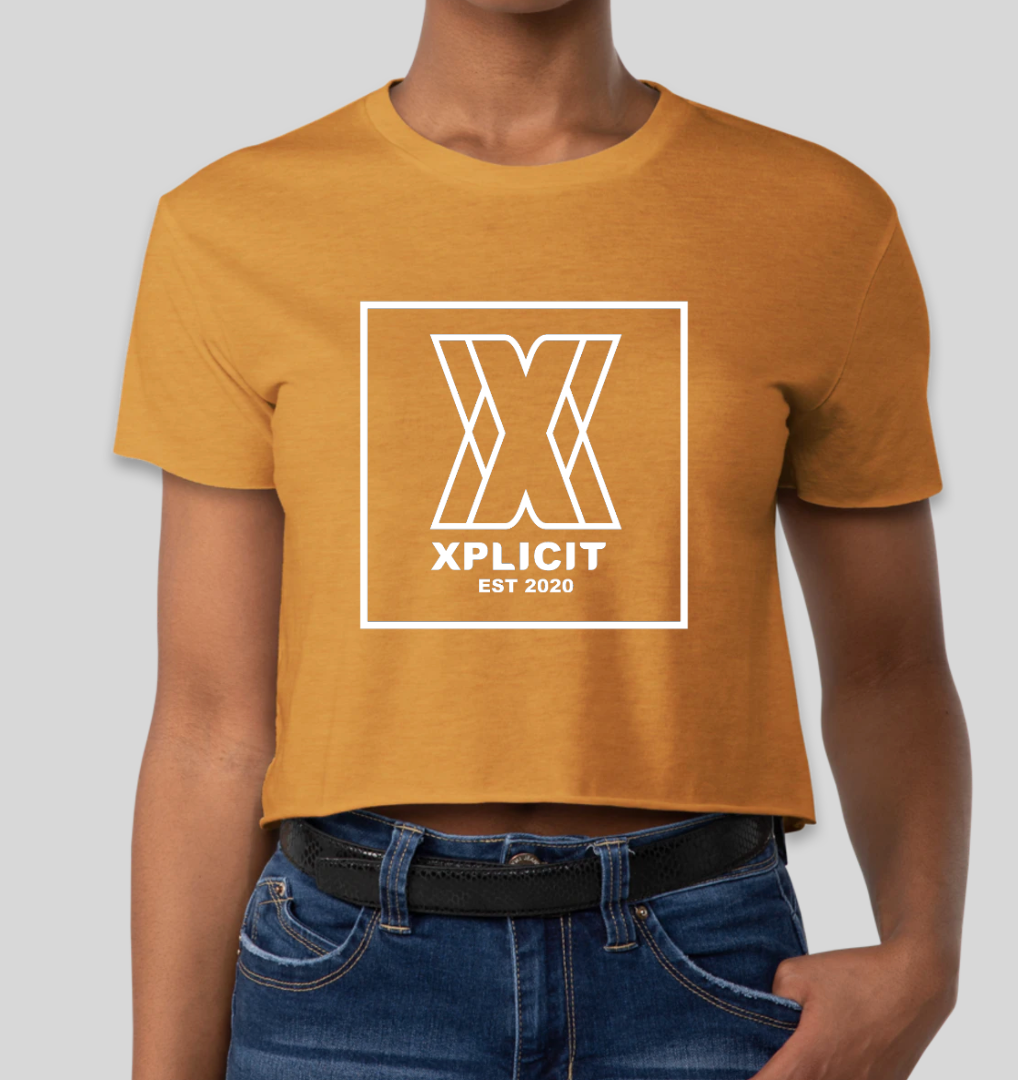
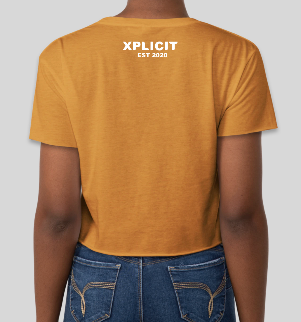

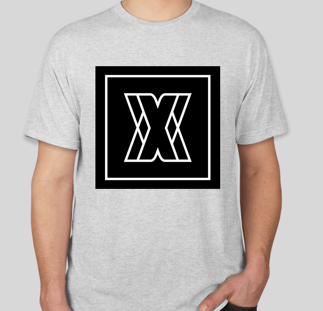
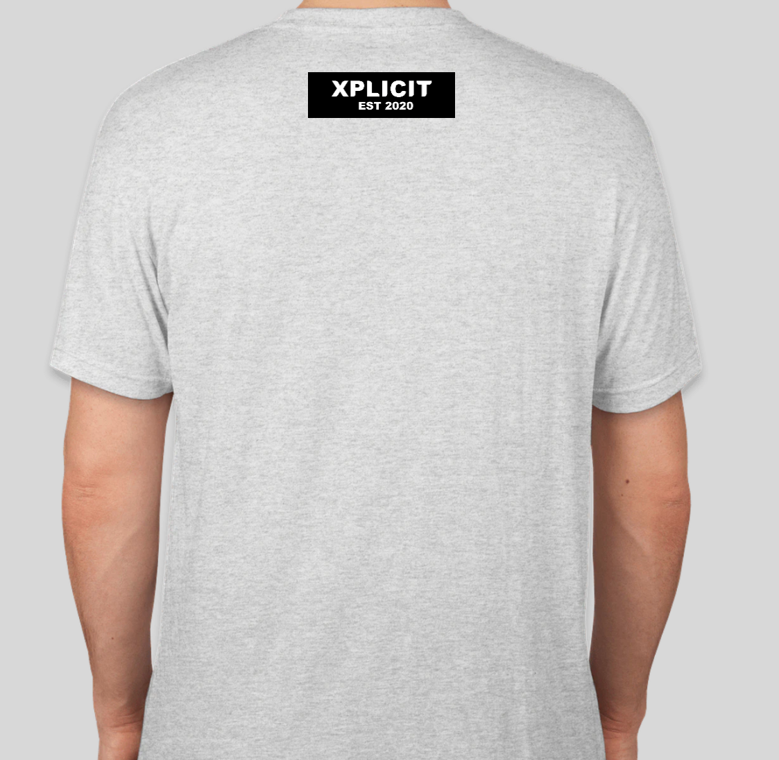

Xplicit logo on merchandise: women's crop shirt, face mask, men's t-shirt, and small window decal.