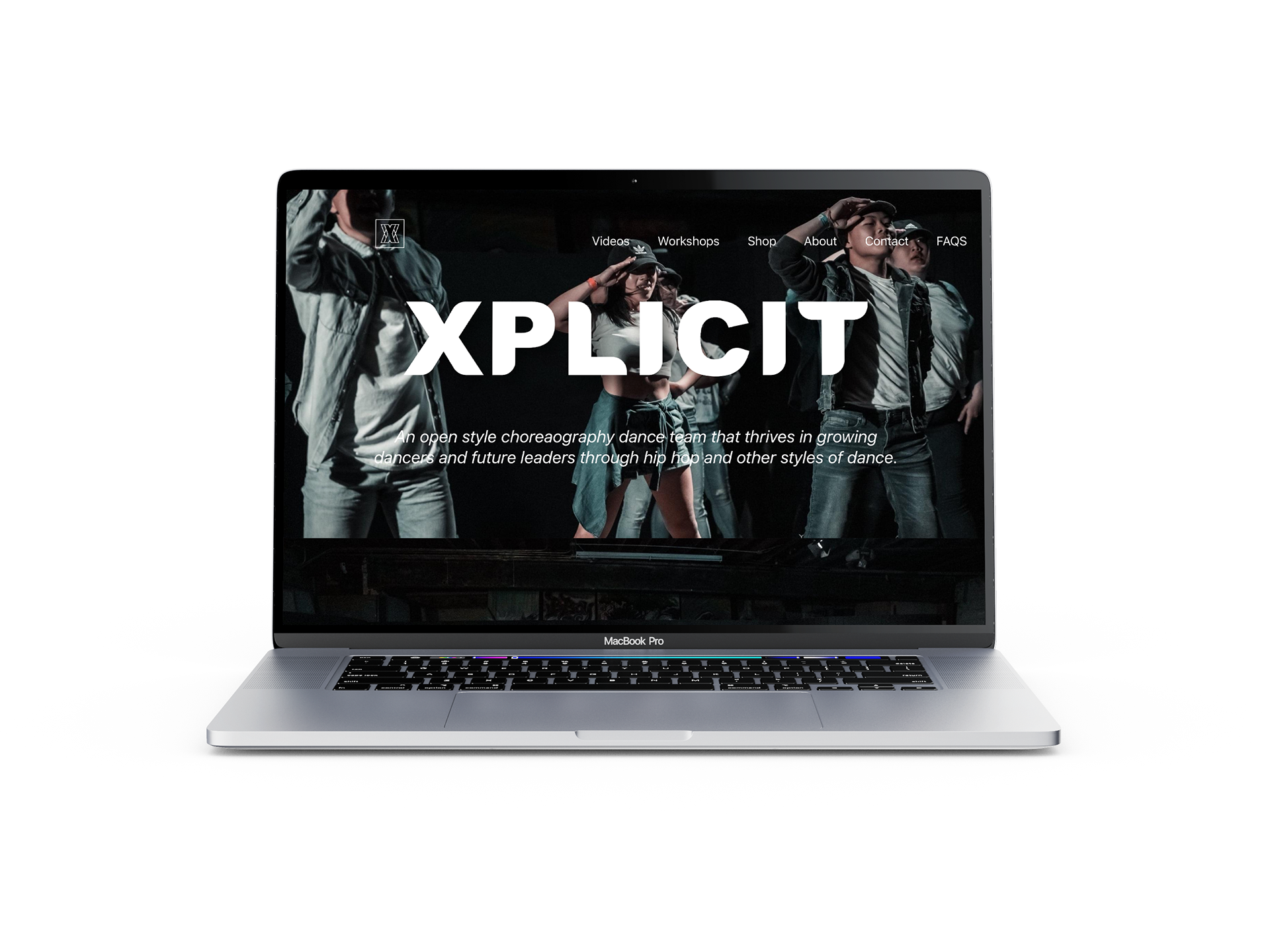
MOBILE APPLICATION
UX Designer ▪️ 4 months, solo team ▪️ Sketch, InVision, Marvel POP, Miro, Optimal Sort
GOAL:
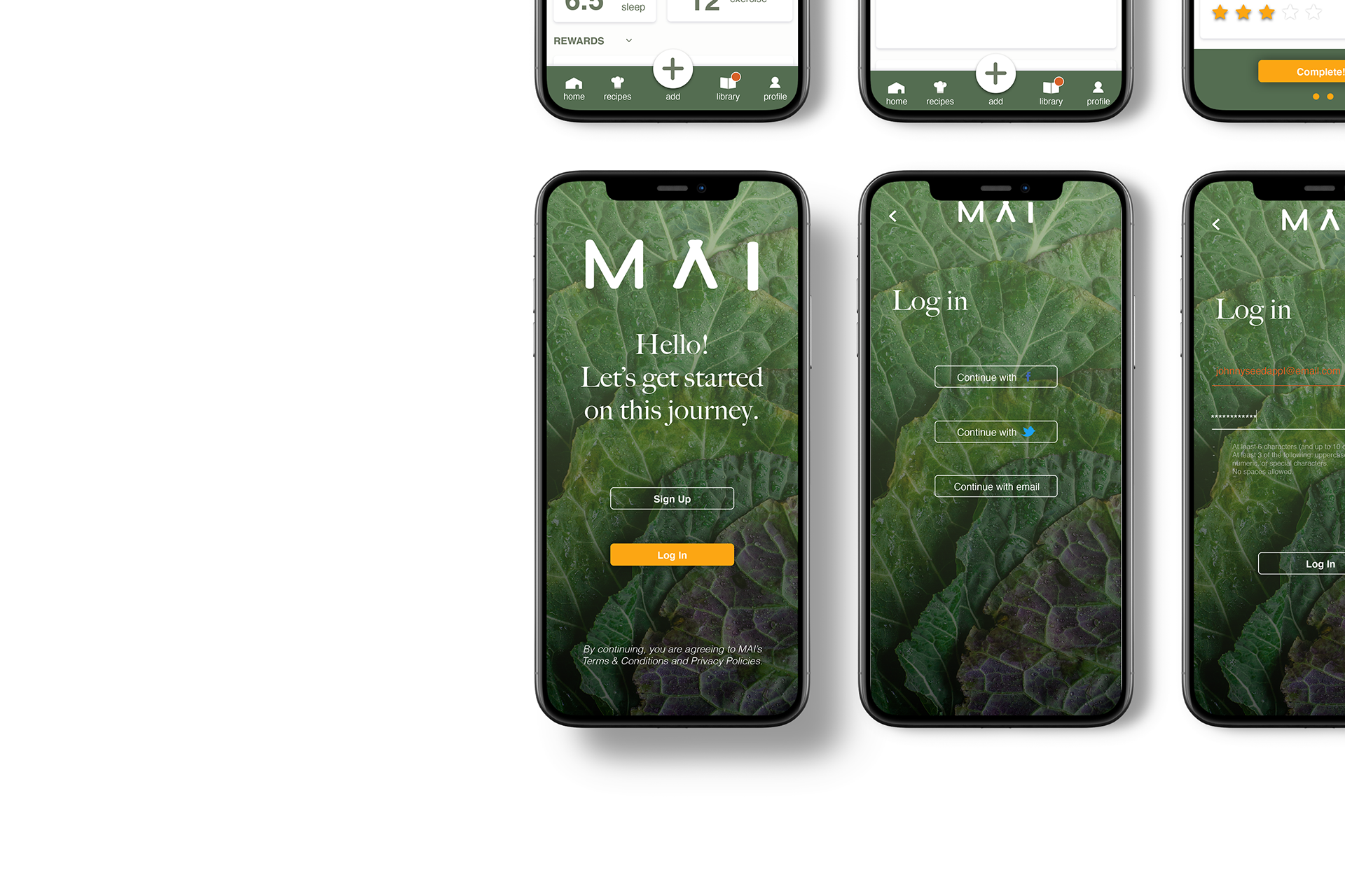
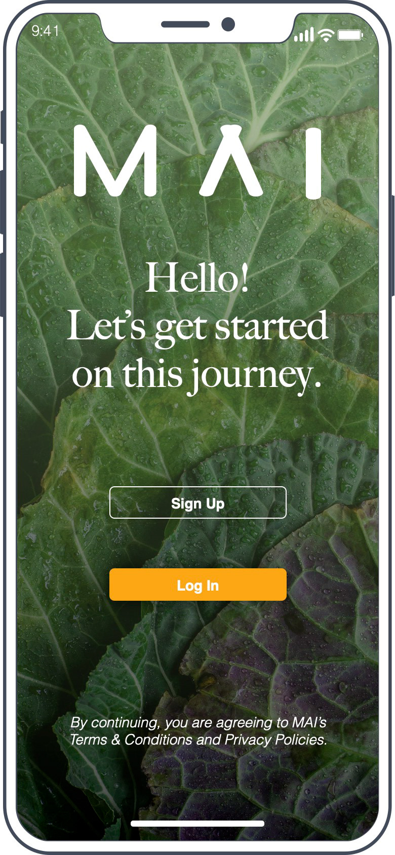
MAI is a mobile application that solves the need for busy 9-5 adults who values efficiency and is looking to take control of their health. The goal is to create an application that aids the user in changing bad eating habits through easy documentation and self-reflection. I lead the product from conception to implementation, researching the problem space, and then implementing usability tests and rounds of iterations.
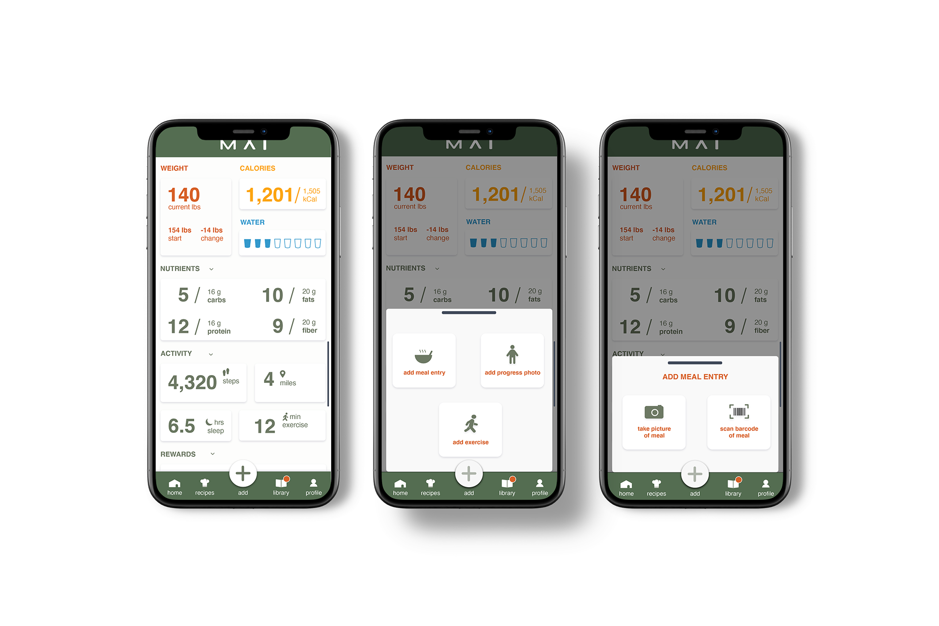
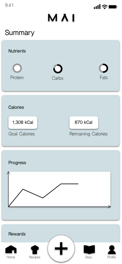
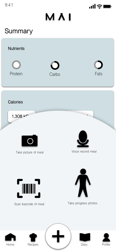
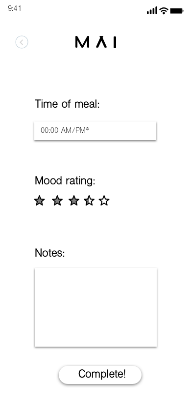
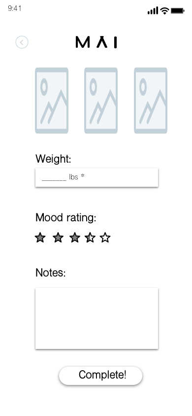
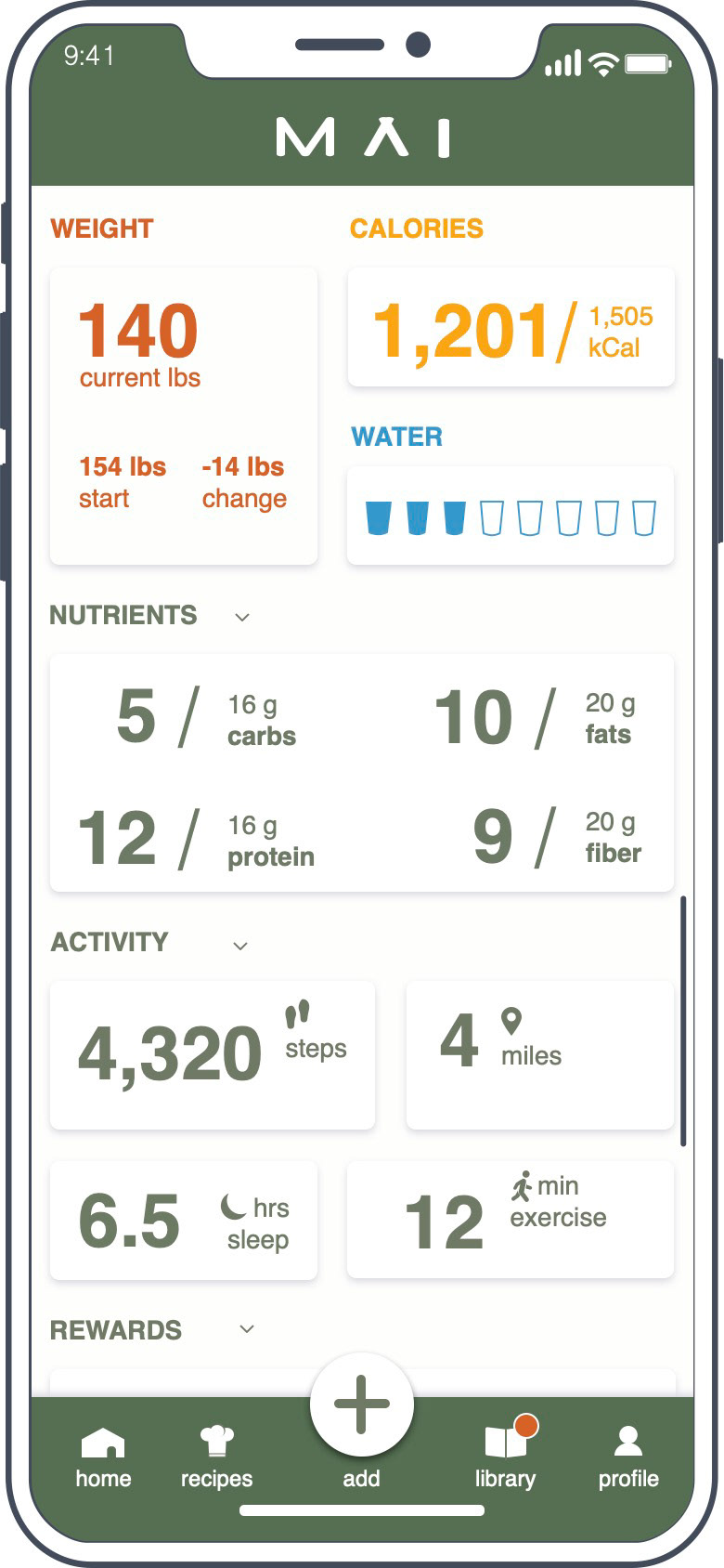
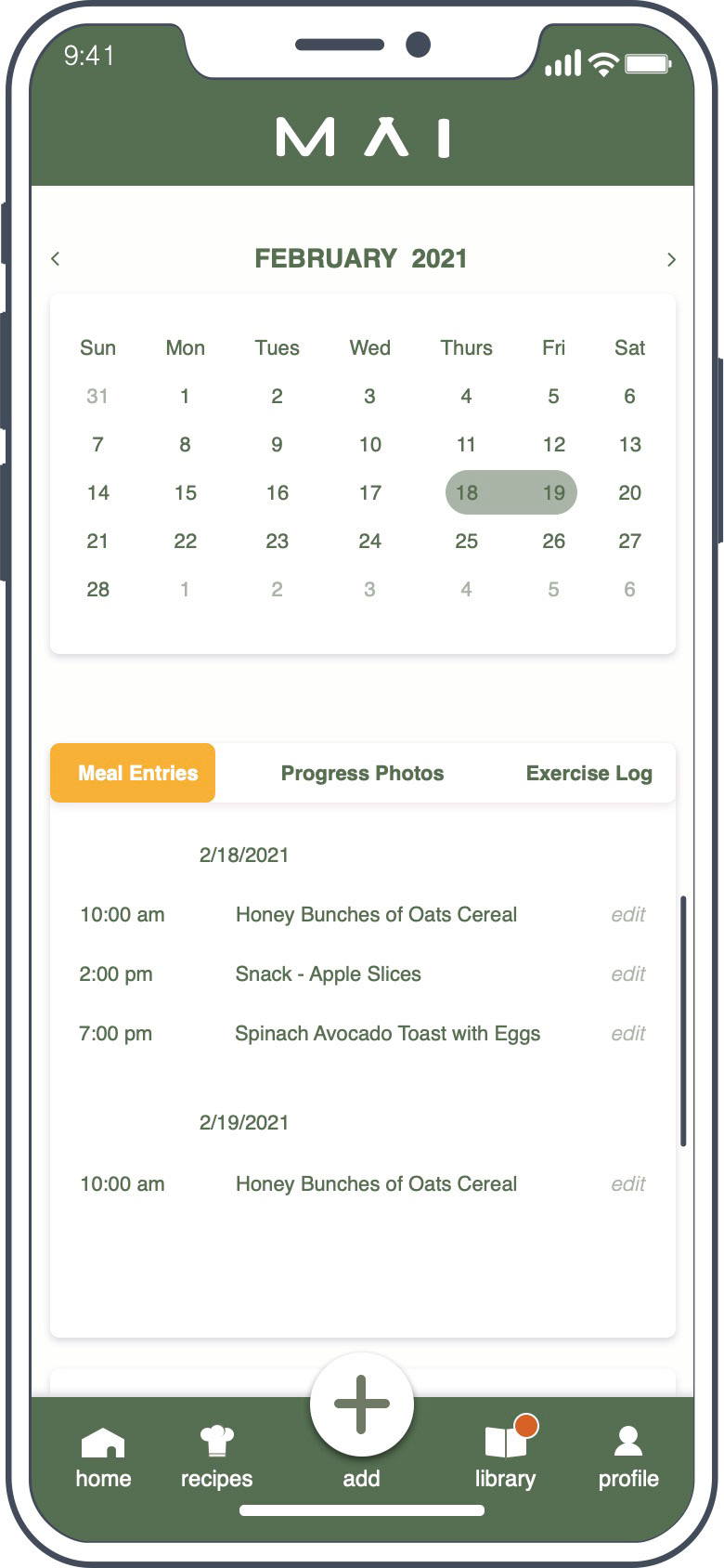
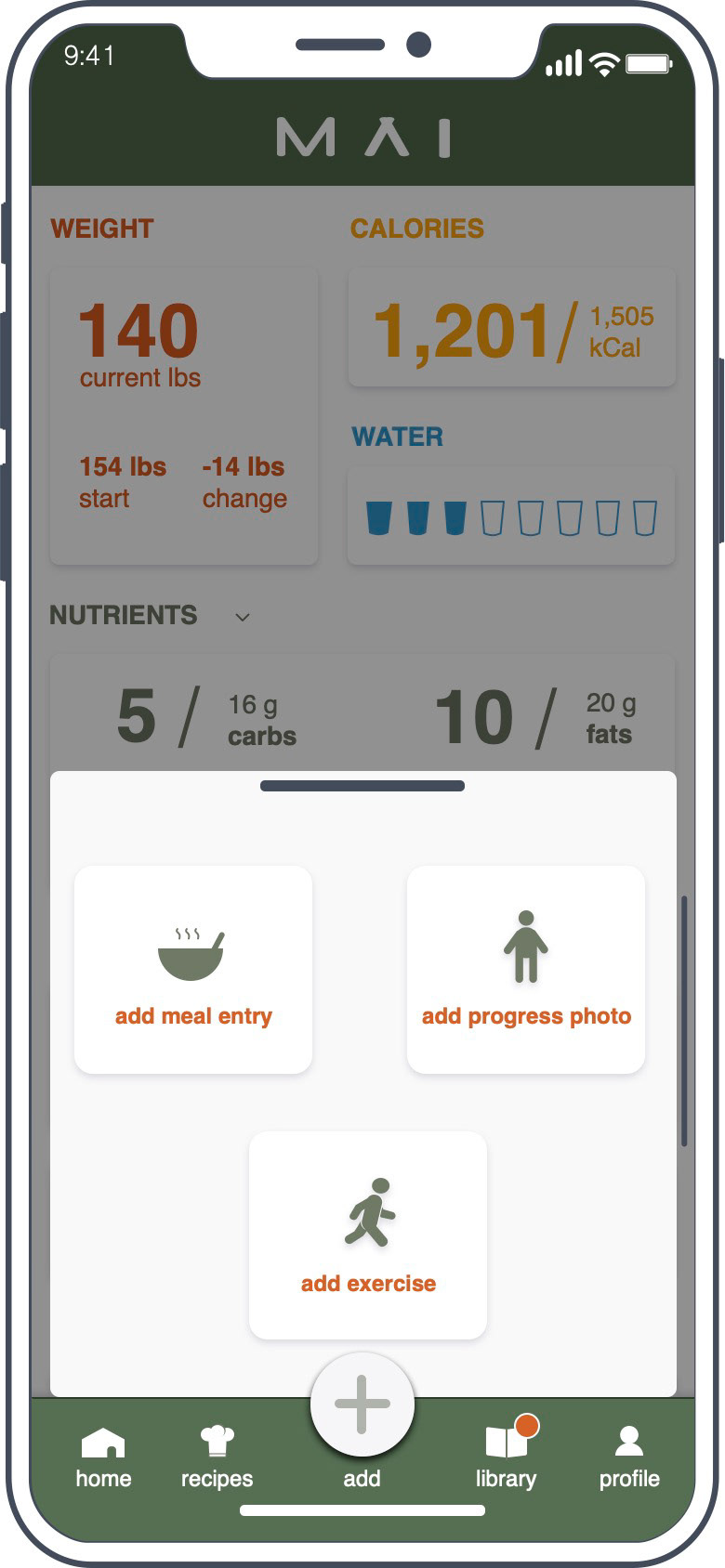
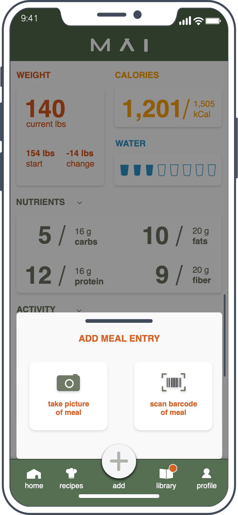
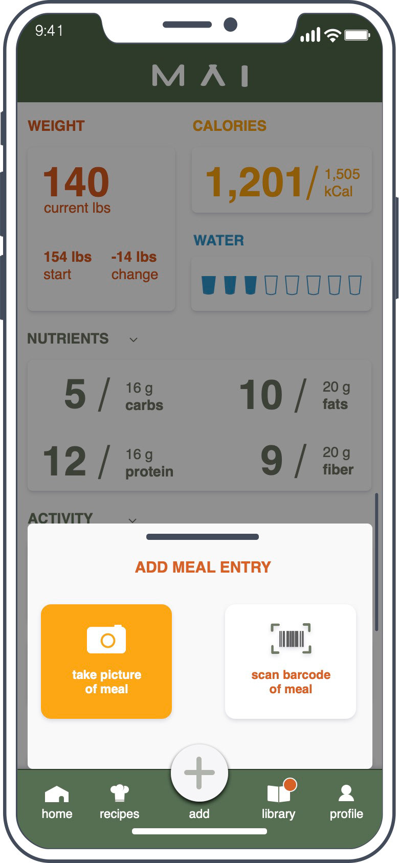
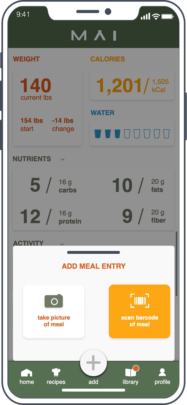
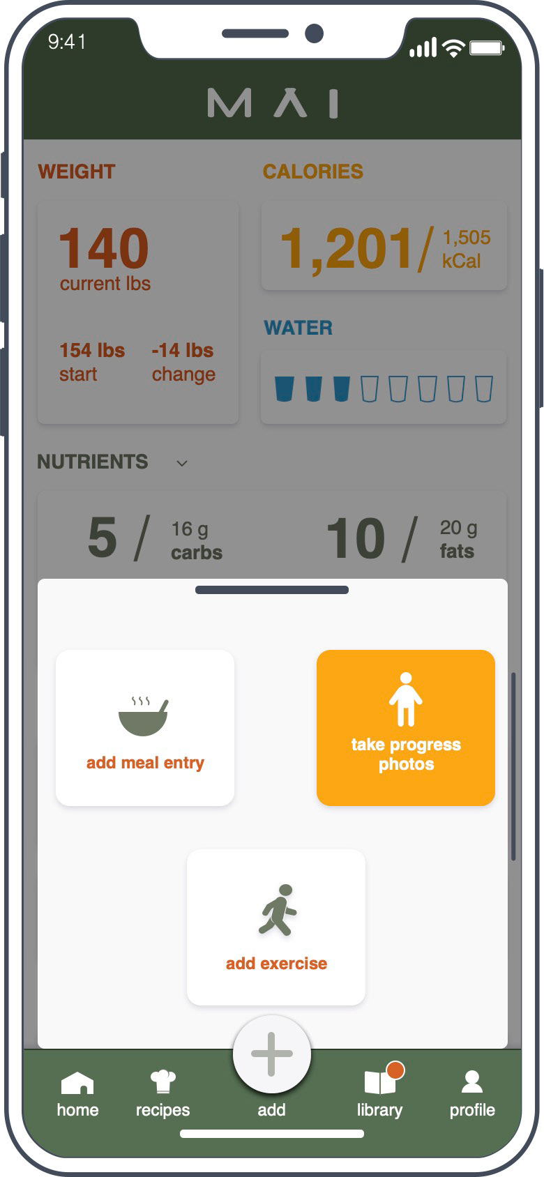
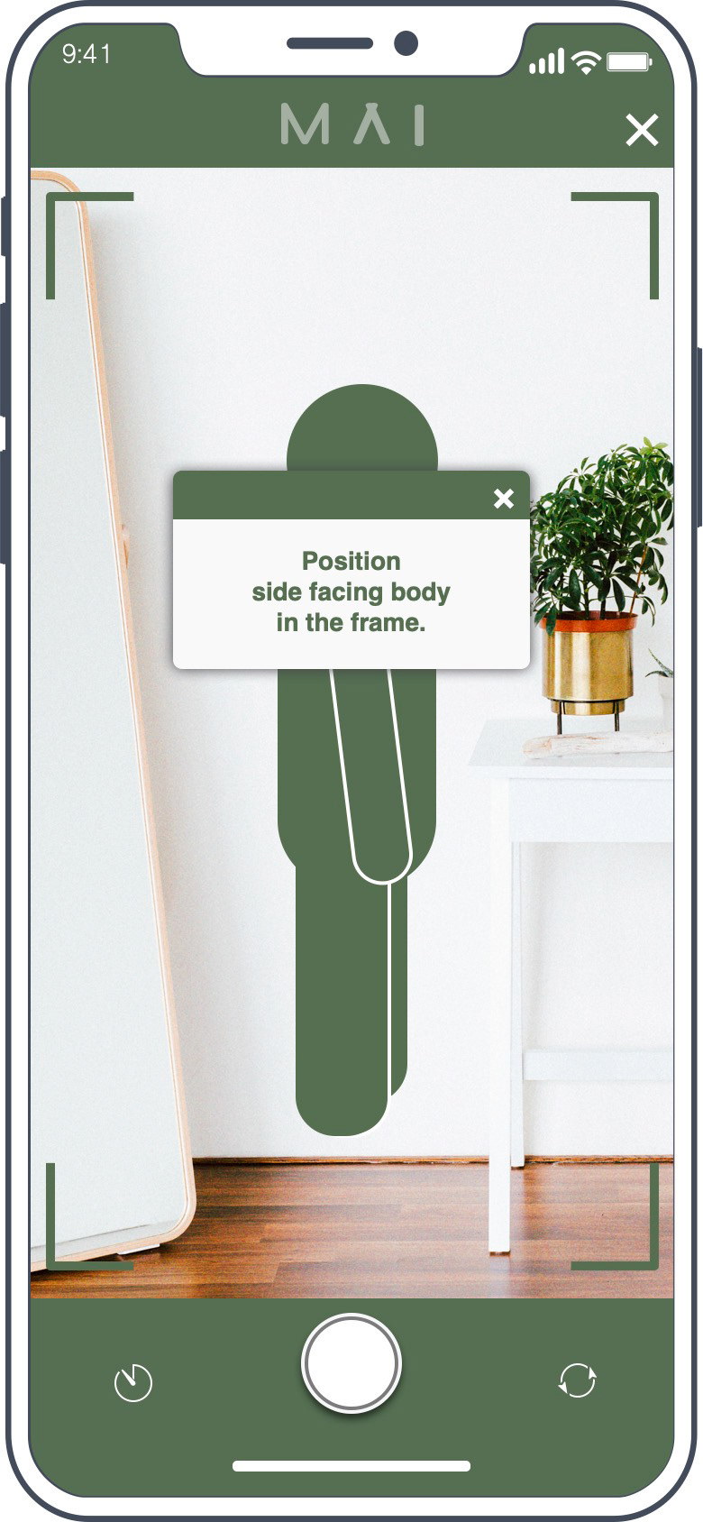
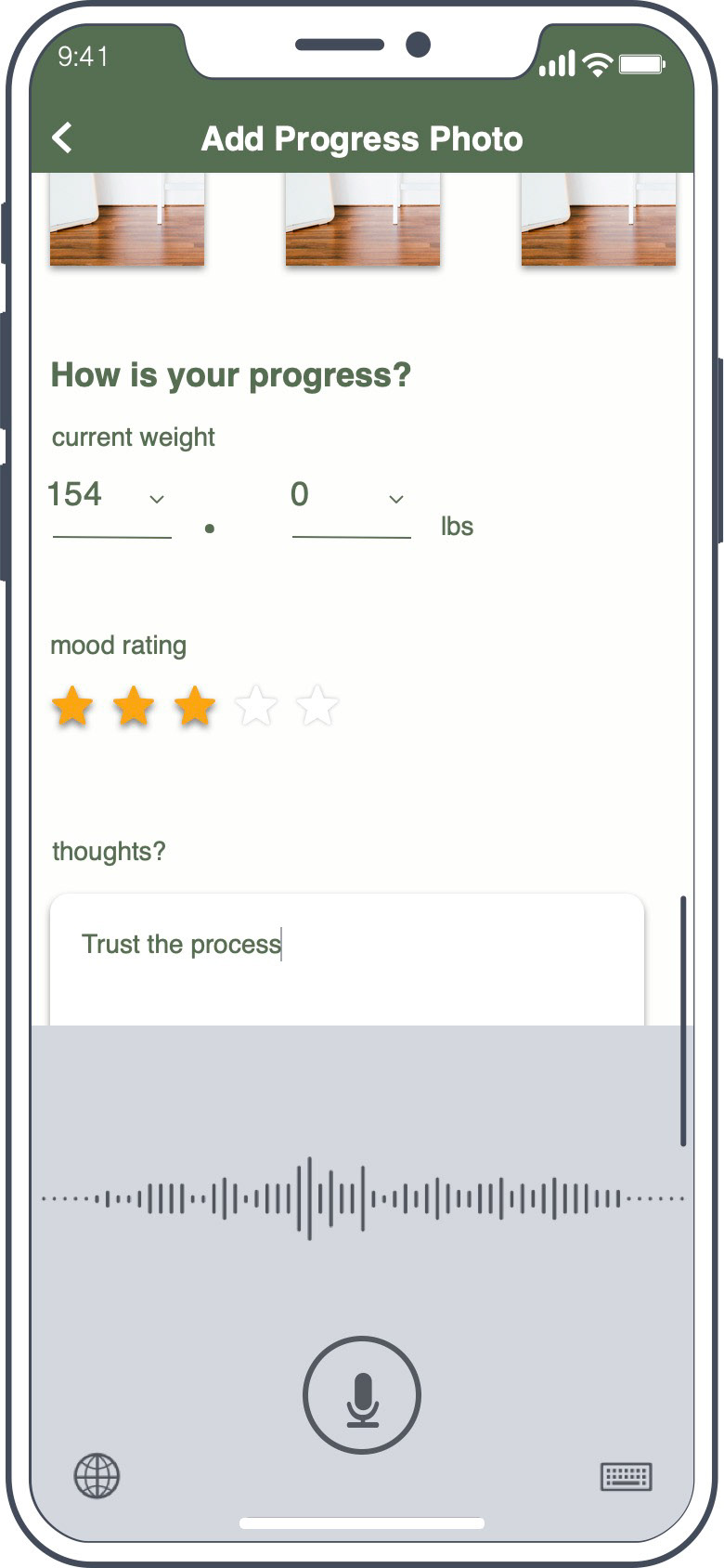
Home Screen, Document Actions, Meal Entry Actions
PROBLEM SPACE:
People who are beginning a weight loss or healthier lifestyle journey tend to document their progress. I’d like to explore how might I improve their experience as they transition to new daily norms. My biggest design challenge is creating an experience that has a sustainable methodology that will encourage a healthy relationship between food and body image.
User Pain Points:
1. Need to balance priorities like family, work, and personal well-being.
2. Tracking meals are time consuming.
3. Can be easily overwhelmed and often leads to emotional eating.
1. Need to balance priorities like family, work, and personal well-being.
2. Tracking meals are time consuming.
3. Can be easily overwhelmed and often leads to emotional eating.
APPROACH:
Traditional Waterfall
I adopted a waterfall design approach to fully understand the scope of this problem space. This involved extensive secondary research, user research, and competitive analysis laying the foundation for human-centered design solutions. Then I led rounds of usability tests to validate solutions and make incremental improvements.
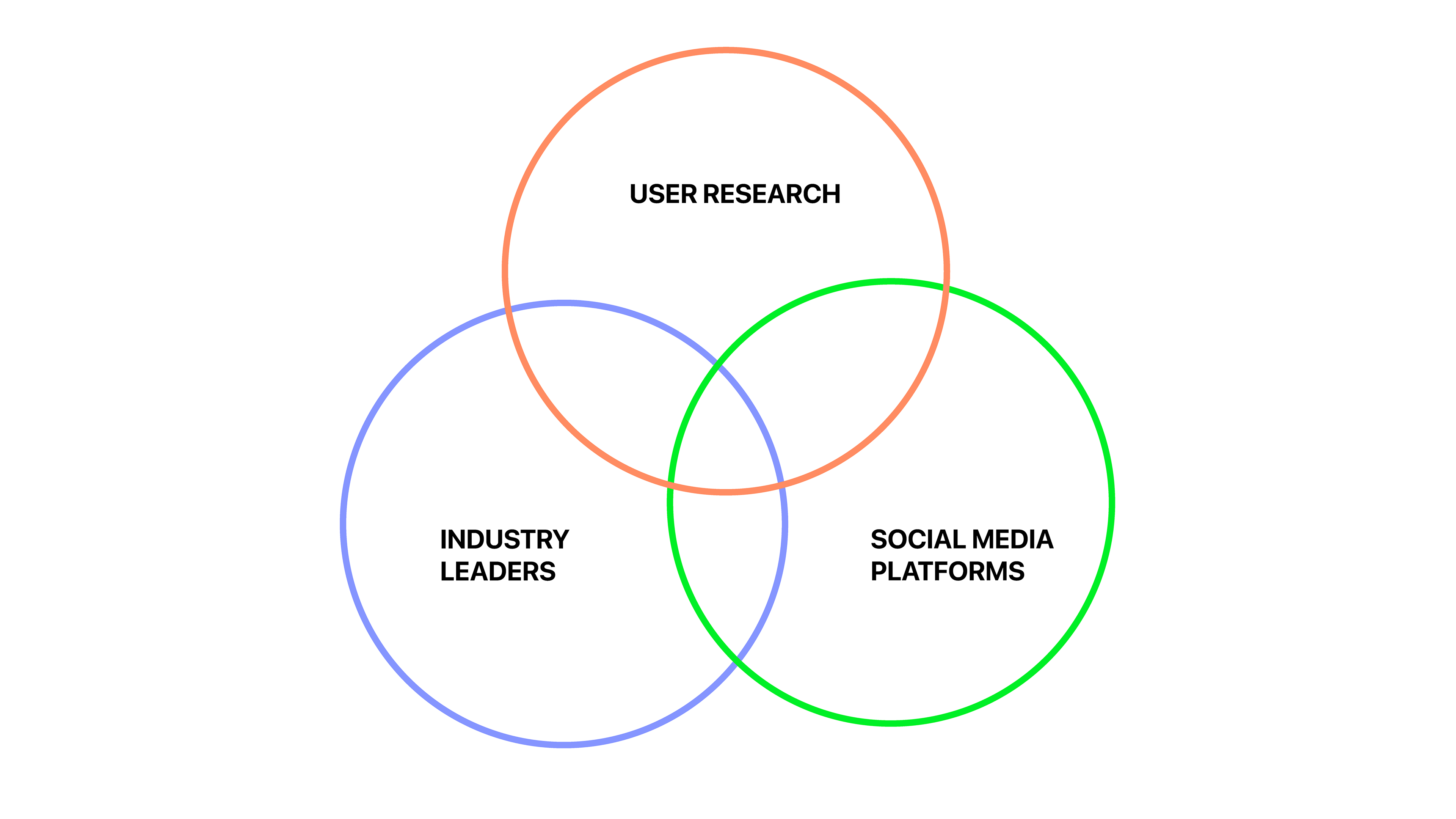
Venn Diagram approach in research
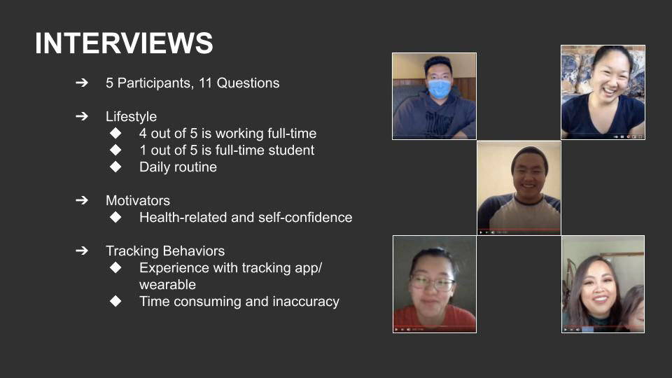
User Interviews and Research
User Interviews and Research
During user interviews and research, I heard over and over and over again how tracking your meal is “time-consuming”.
So, I gathered a list of what participants were using and I downloaded them onto my phone. This time, I played around with the UI and realized how much the competitors’ process reflected boring school work. I then shifted my focus to apps that were engaging and entertaining like social media.
My secondary research proved there is science behind behavioral changes and no doubt, I had to include an educational component to lower the risk of a user bouncing back on their lifestyle journey. In merging something educational and engaging, I created MAI -- an Instagram-y version of MyFitnessPal.
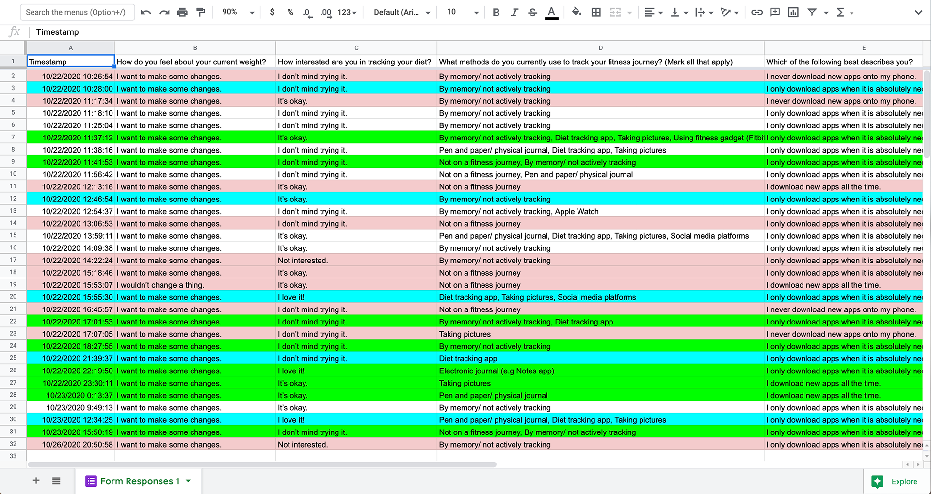
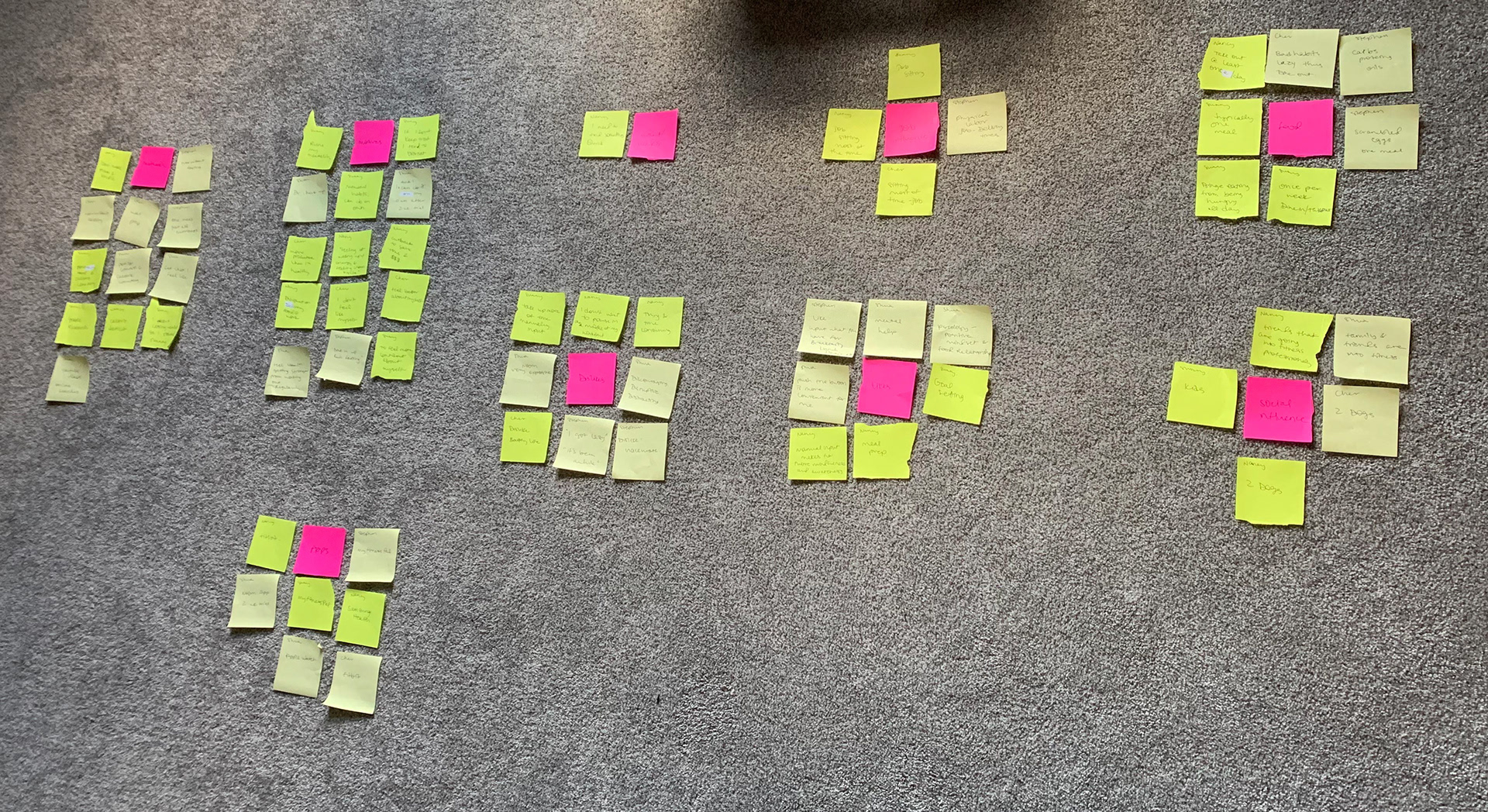
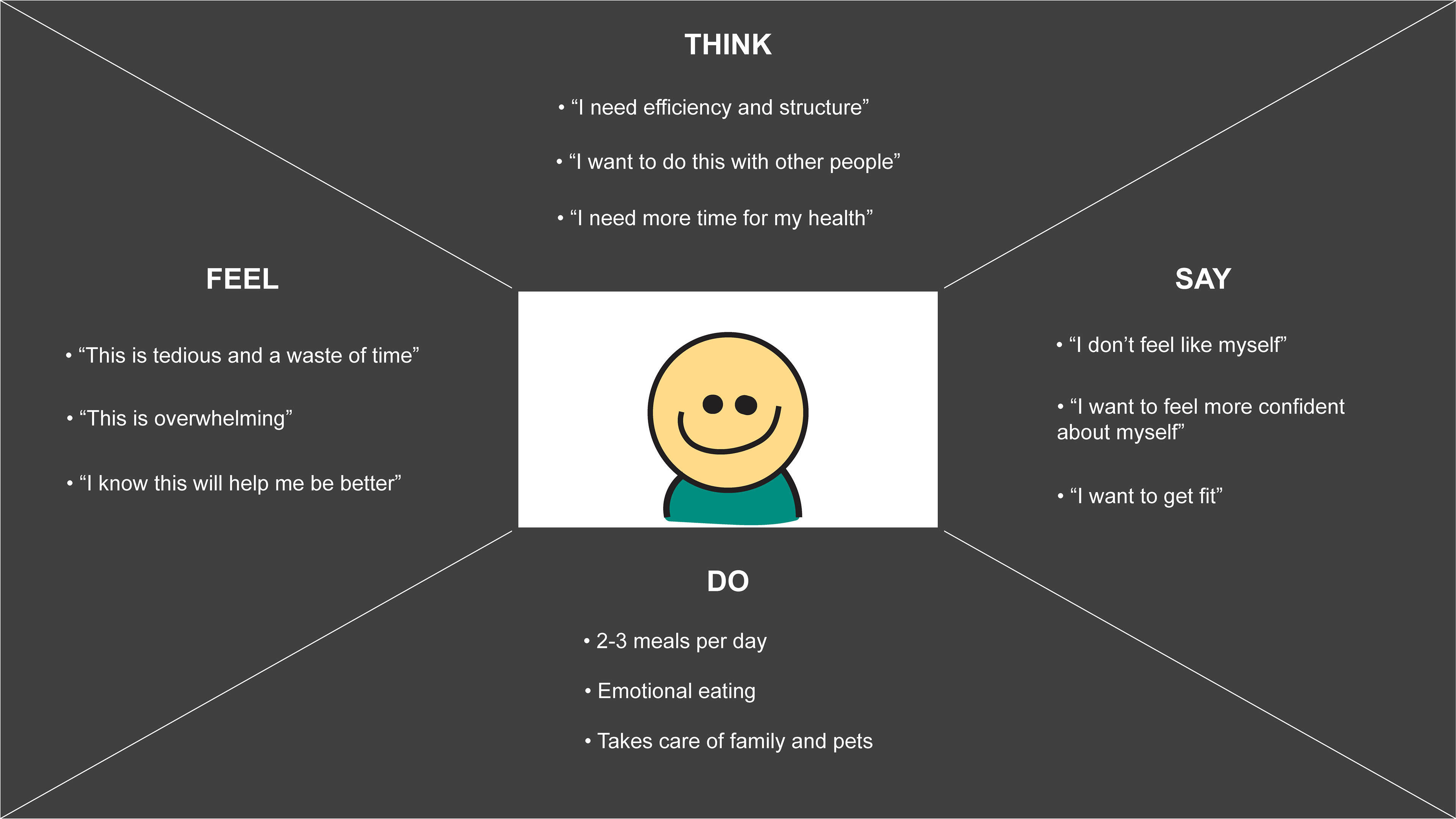
Screener Survey, User Interviews, Affinity Mapping, and Empathy Mapping
PERSONA
By understanding their lifestyle and behaviors, I made affinity and empathy maps to brainstorm and organize pain points, goals, and concepts for my persona.
What I found was, we have this adult, whose life is busy busy.
1. Need to balance priorities like family, work, and personal well-being.
2. Tracking meals are time consuming.
3. Can be easily overwhelmed and often leads to emotional eating.
So our target audience is someone who needs a quick and effective methodology that is sustainable for a fast-paced life.
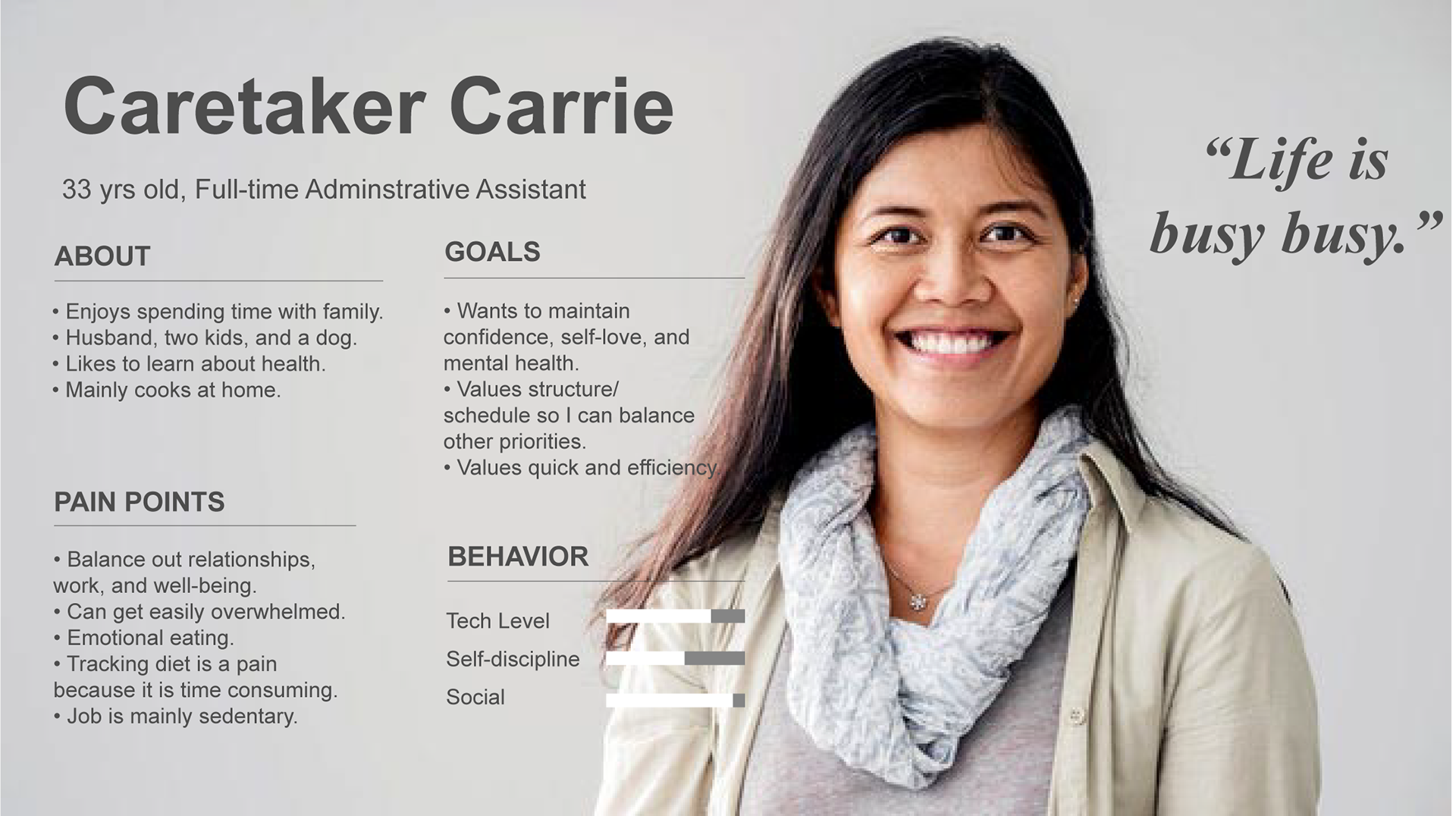
Persona - Caretaker Carrie
MVP (MINIMAL VIABLE PRODUCT)
This combination of research was very helpful in defining the features for my MVP (minimal viable product):
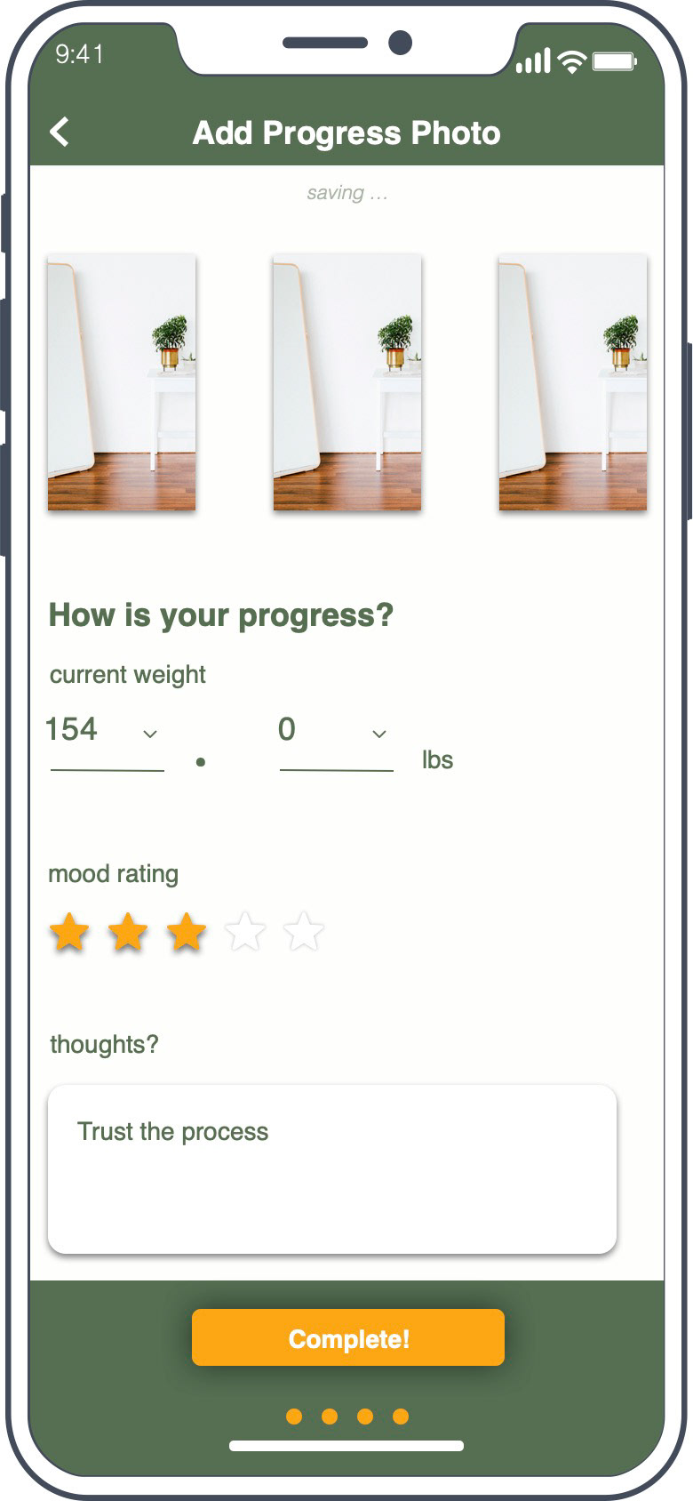
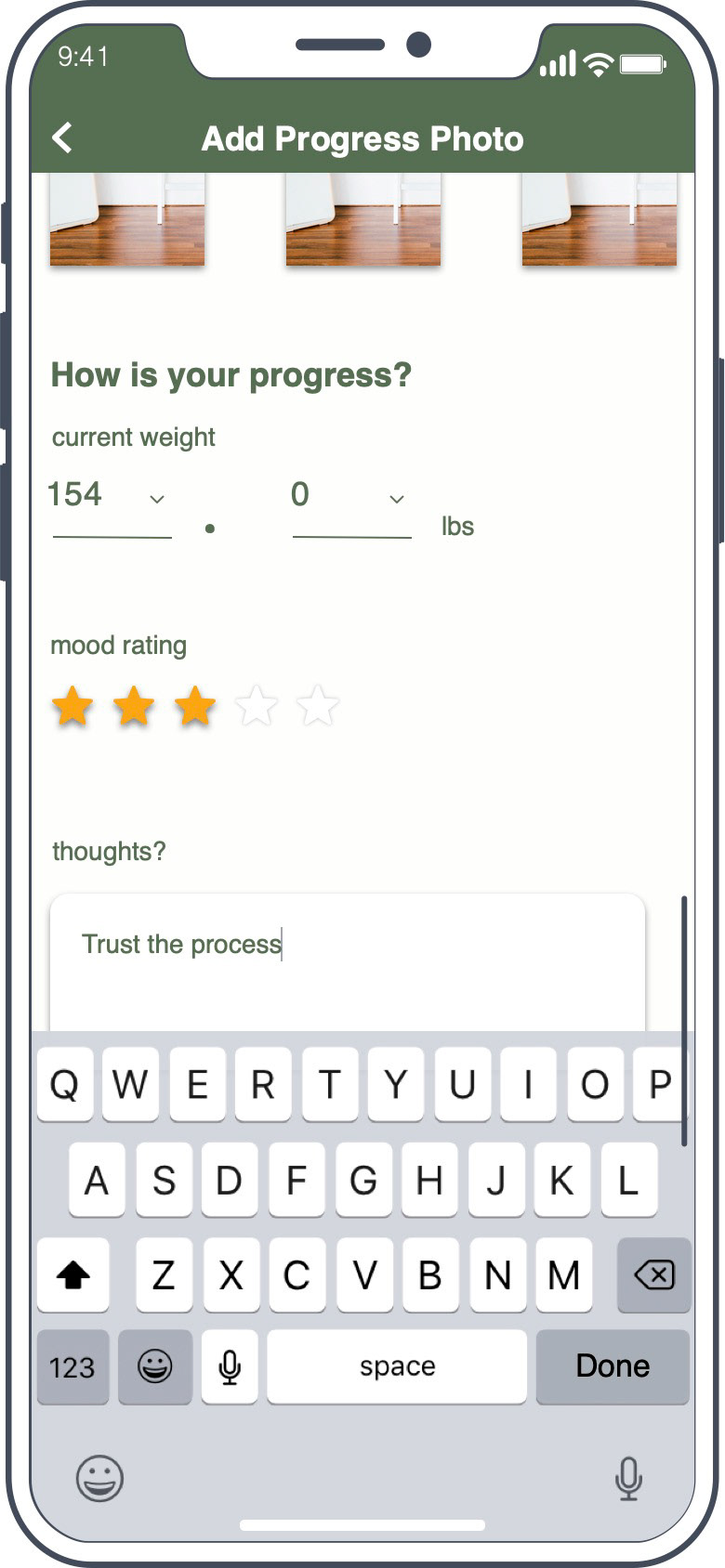
1. Design for the mobile UI
2. Decrease amount of typing
3. Provide space for reflection
DESIGN:
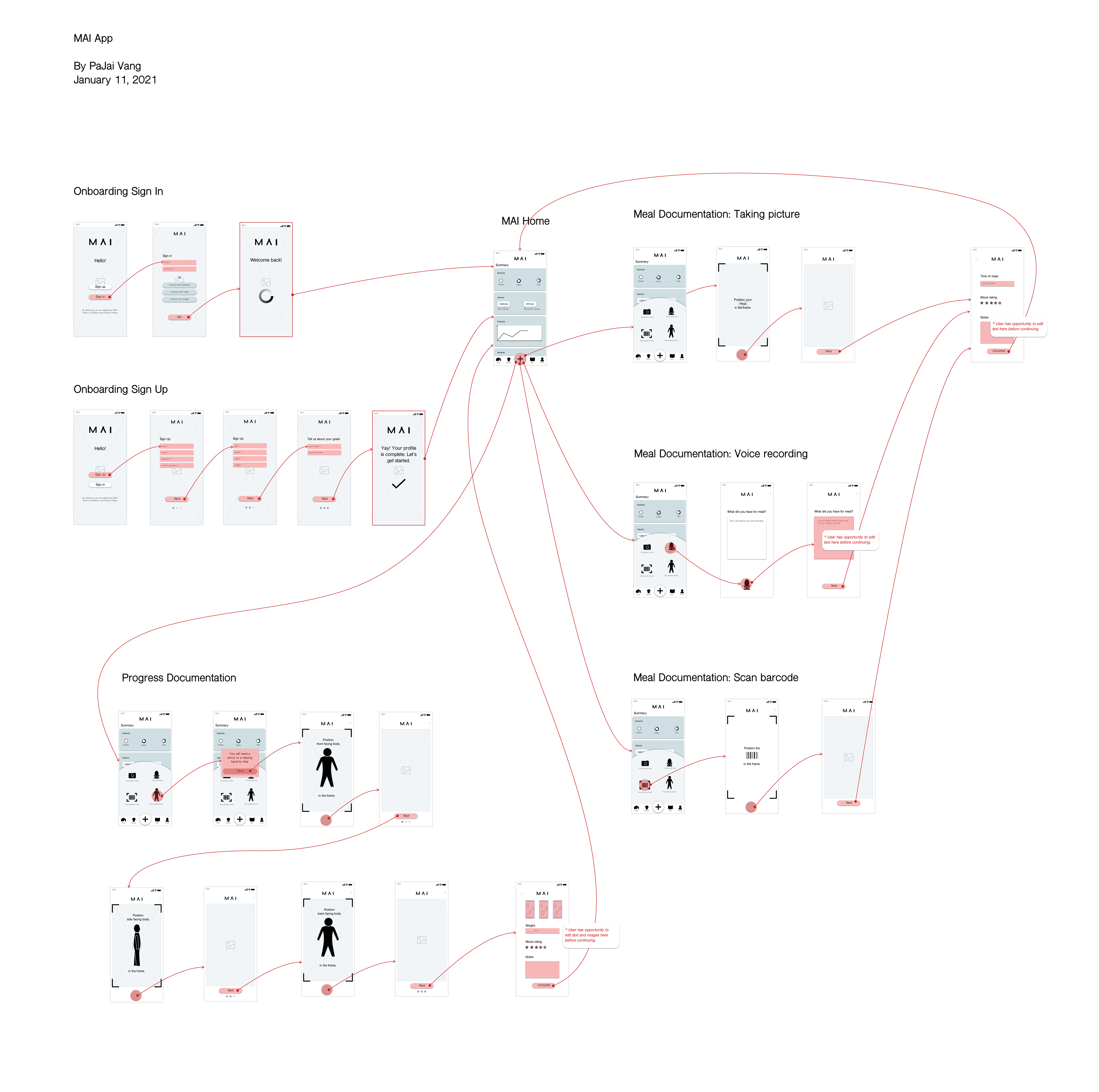
User Flows
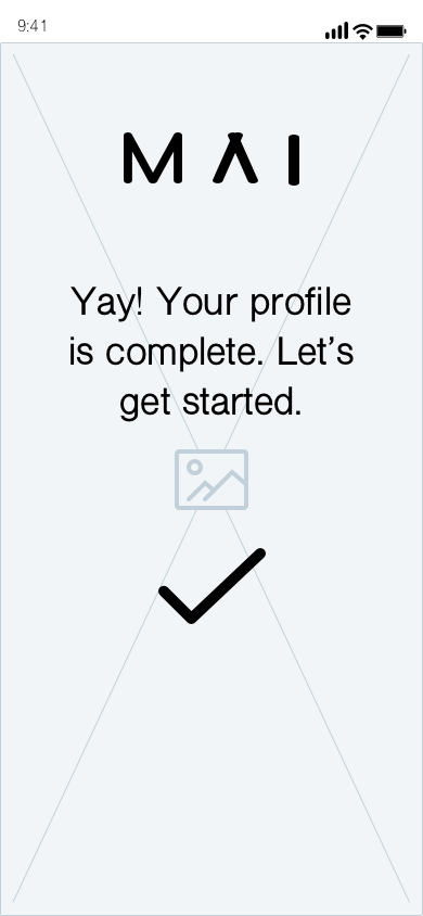
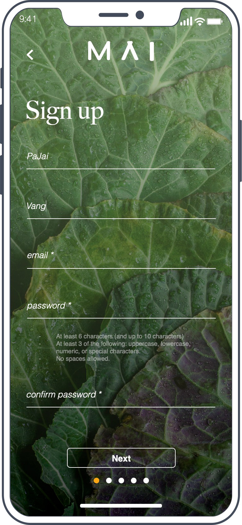
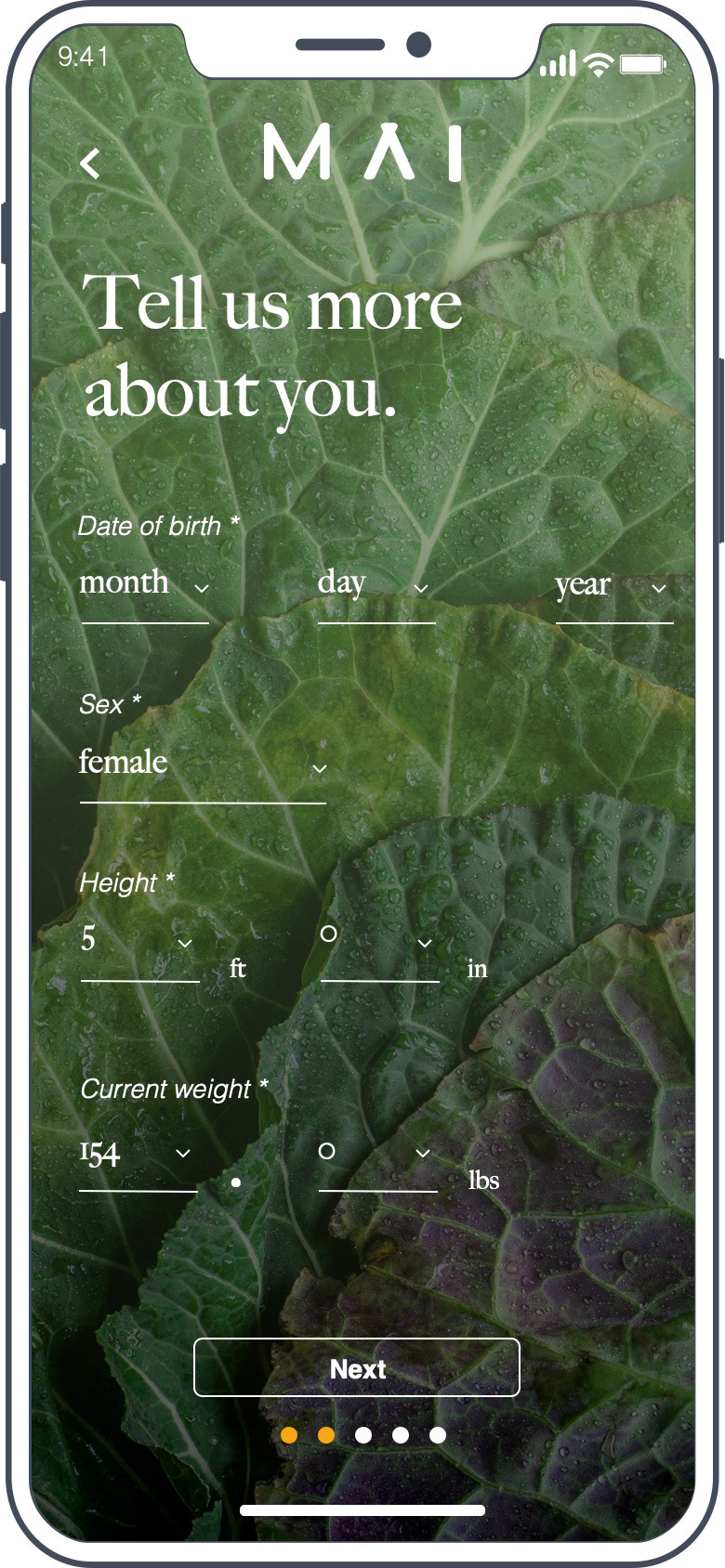
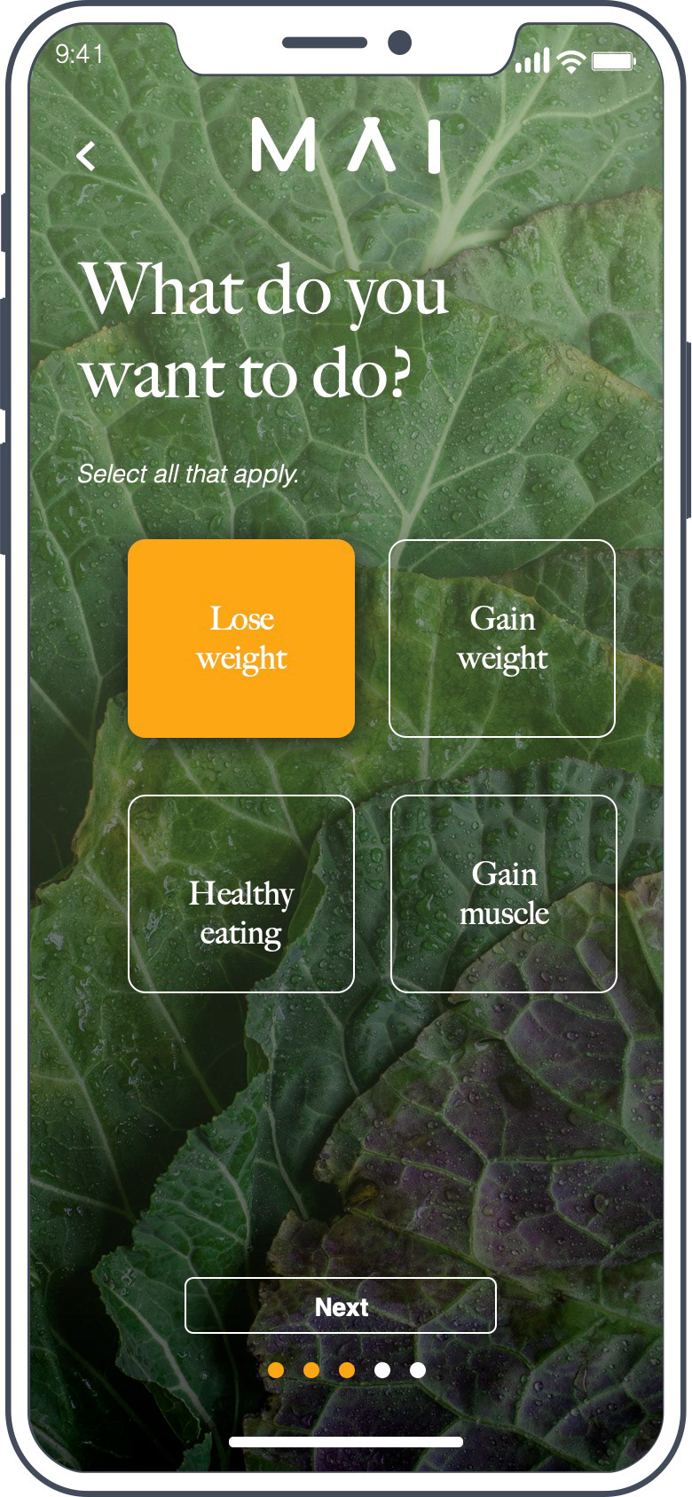
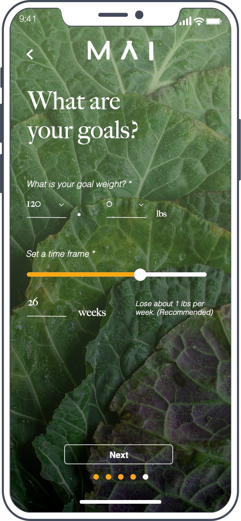
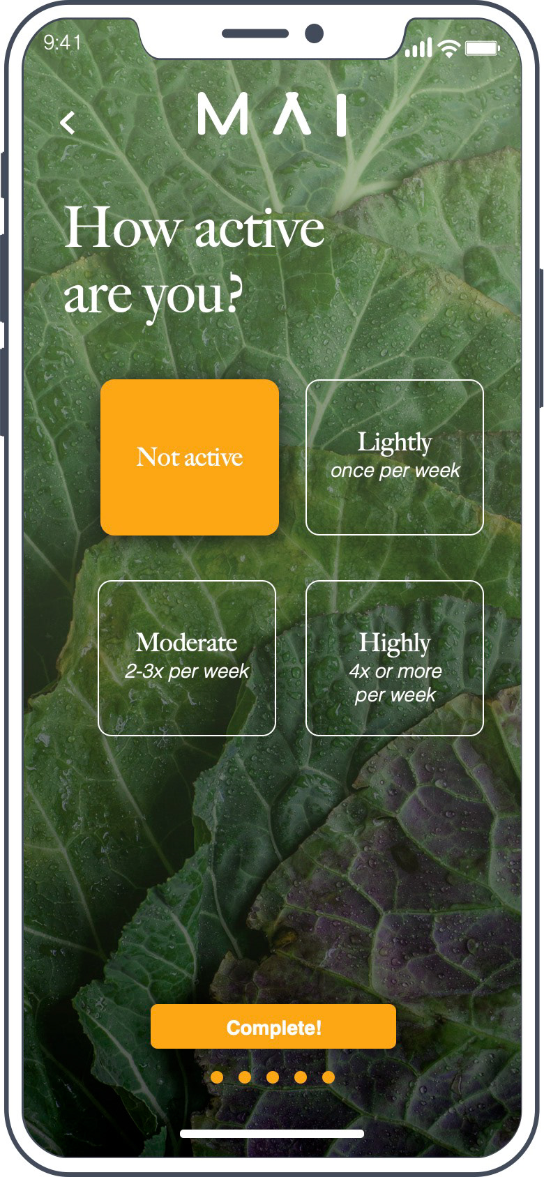
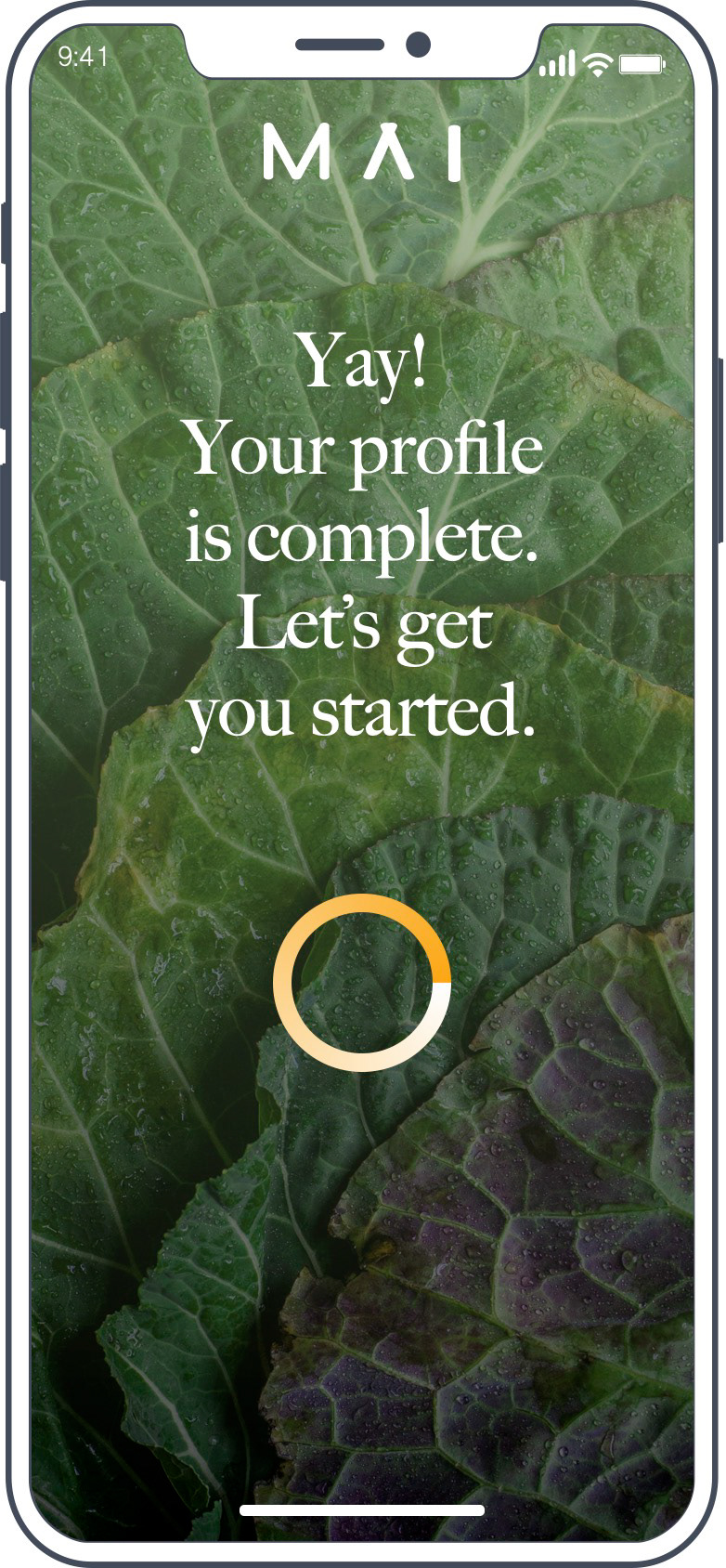
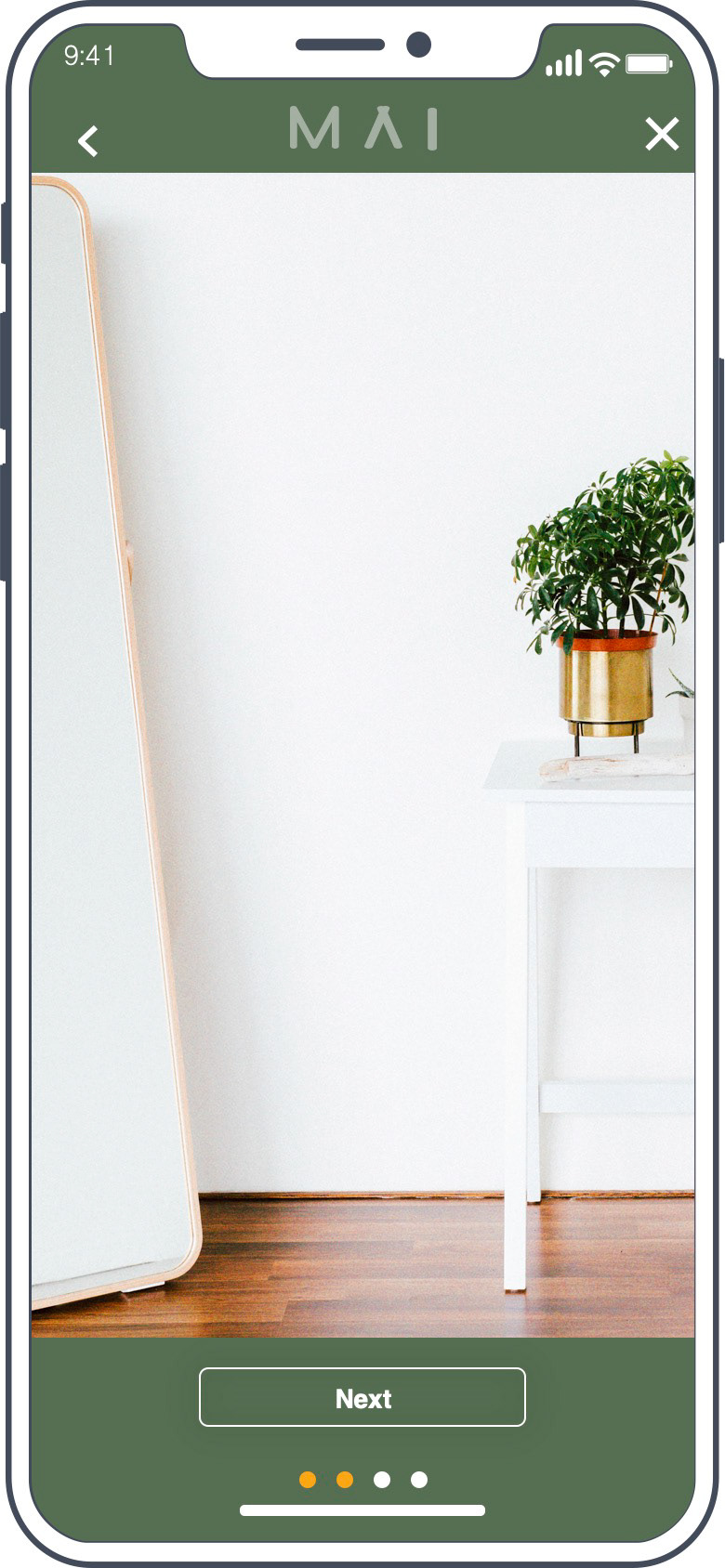
In making my design decisions, user flows helped narrow down the core routes that the user needed to take in order to optimize their experience on the app, I narrowed it down to three: Onboarding, Meal Documentation, and Progress Documentation.
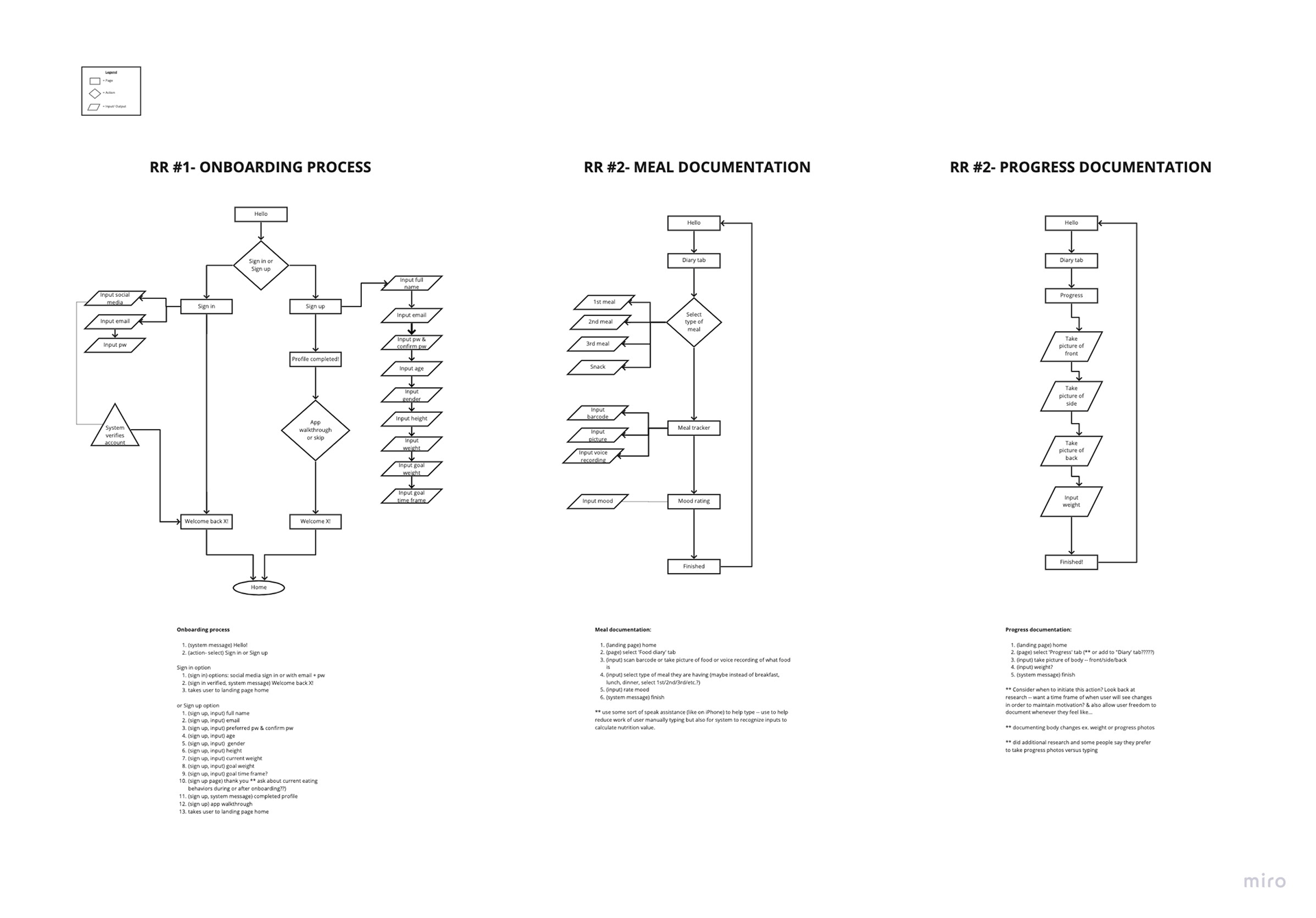
User flow of red routes
Sketching and Wire framing
Sketching and wire framing helped me visualize solutions that can seamlessly integrate different ways to document this experience into one interface.
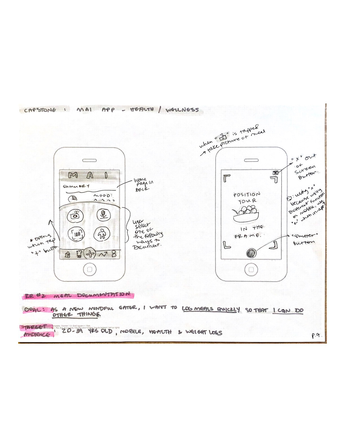
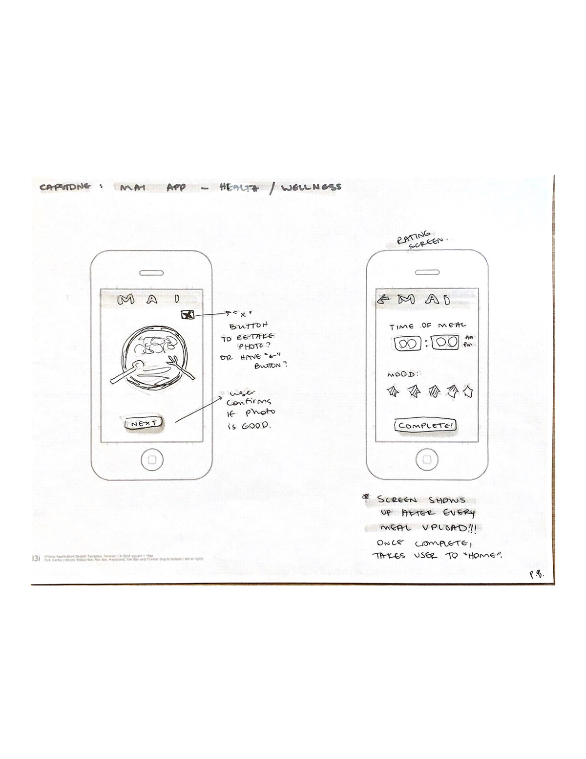
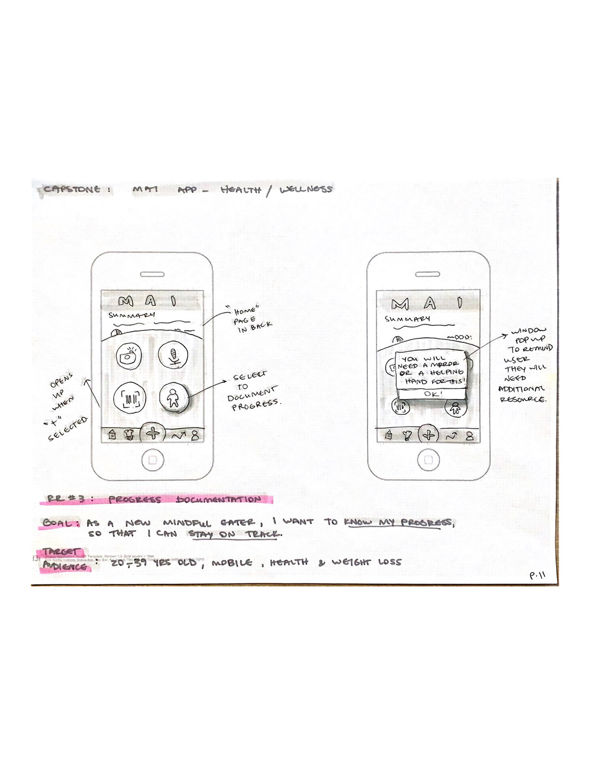

Some early stage sketches.
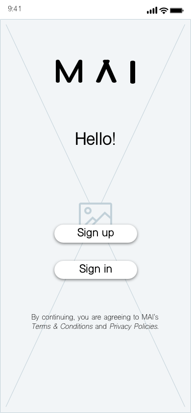
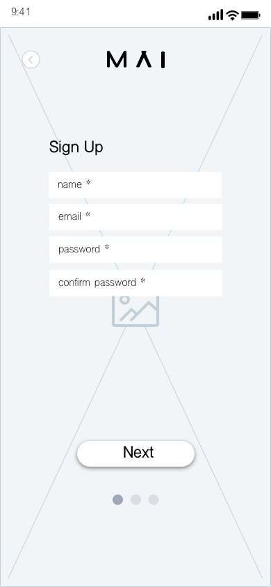
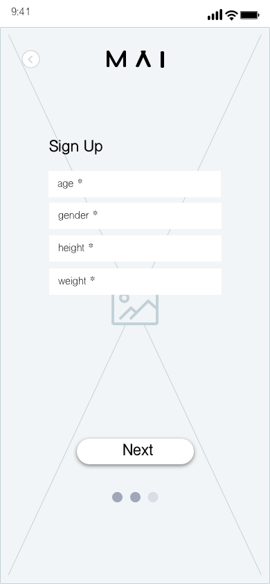

Low-Fi Wireframes
Wireframes and User Journey Flow
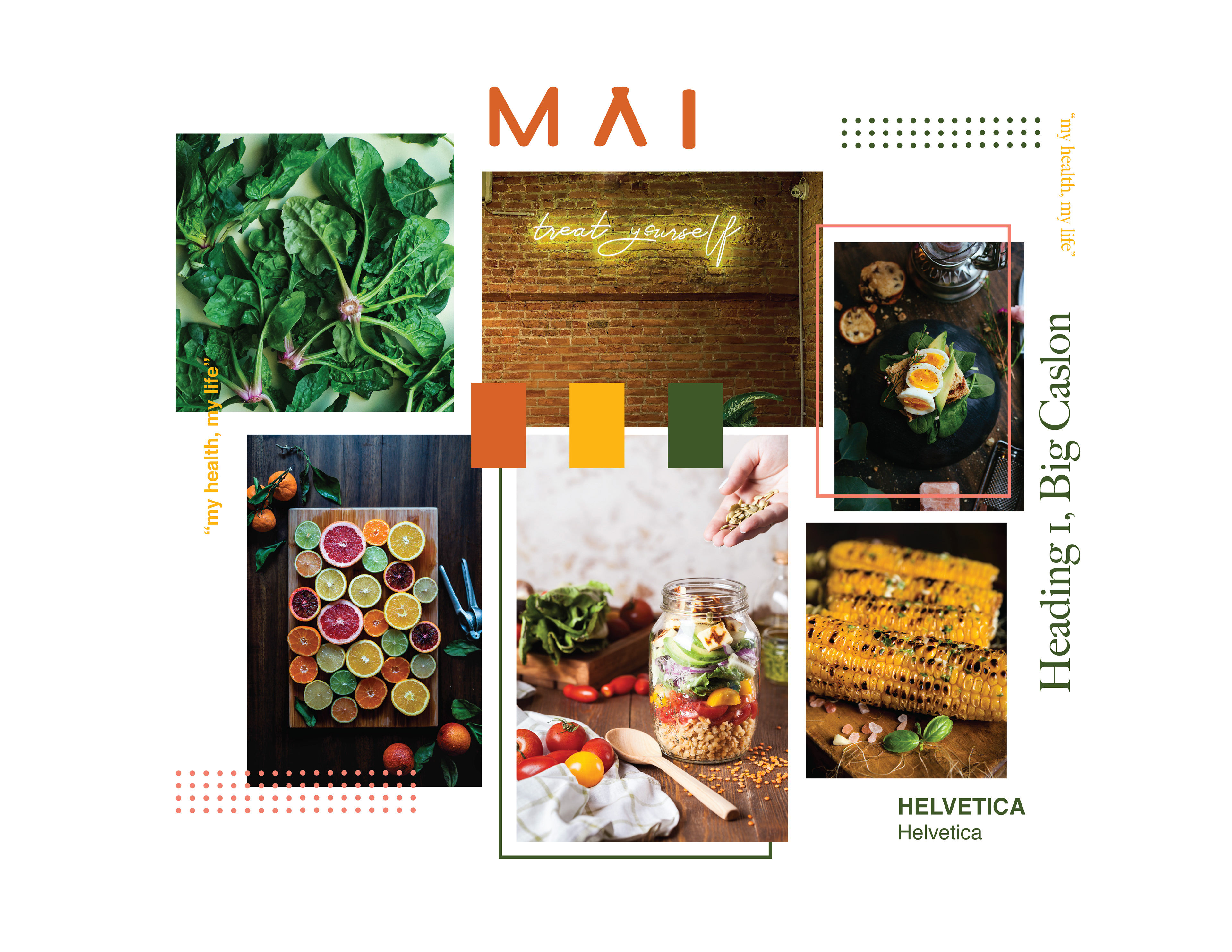
Moodboard
Because the app will be personal, my design process was adding visuals that will evoke sensibility and convey “food”, “trustworthy”, and “comfort”.
I learned that in color psychology, green is related to health, balance, and life. With this in mind, I found green to be the most effective color for the purpose of this app and hence the primary color. The secondary colors were orange and yellow. Orange -- because of its association to food and promotes a sense of positive motivation. Yellow -- because its related to happiness and optimism. And I think these colors really help bring together the high level goals of what I want this app to be for my target users.
SOLUTION:
The approach that I took was understanding what my target audience wanted to do then seeing what competitors were doing. The process was like a Venn Diagram, it allowed me to subtract unnecessary elements and to see what core features to include in my MVP:
Minimal Viable Product (MVP):
1. Design for mobile UI
2. Decrease the amount of typing during documentation
3. Provide space for reflection.
1. Design for mobile UI
2. Decrease the amount of typing during documentation
3. Provide space for reflection.
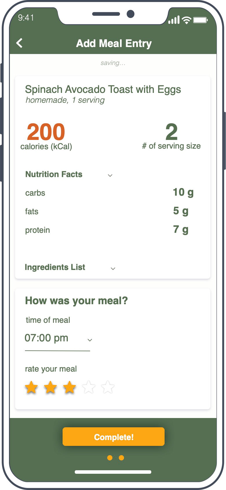
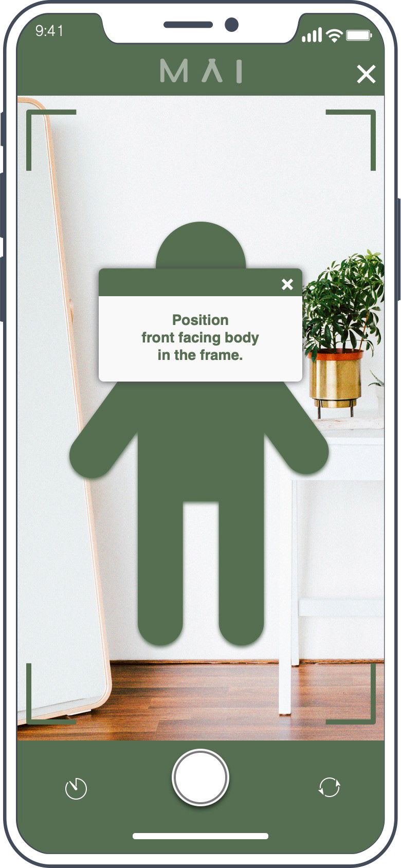
The red routes that I concluded with, were (1) to gather information about intent during onboarding, (2) documenting the user’s meal and progress photos, and (3) self-reflecting. It was early in the secondary research that I learned, to establish successful behavioral changes, the user needs to develop self-efficacy and this happens through self-monitoring.
What I found to be the biggest impact of this design is hearing participants say, “Oh, that was so simple and easy-to-use.” This is encouraging because it showcases low risk in users including the app into their daily routines.
[Link to InVision prototype, https://pajai796483.invisionapp.com/console/share/3V28C7BUGW ]


Final Prototype
LEARNING:
Finding Participants
Finding Participants
What went well during the scope of this project was gathering participants for testing. With the Covid-19 pandemic, it was brought to my attention that health has been an increasing concern for the majority as we are locked down, with most gyms closed or limited, it has created a stricter environment for self-discipline and creativity.
Giving more background on technology to users
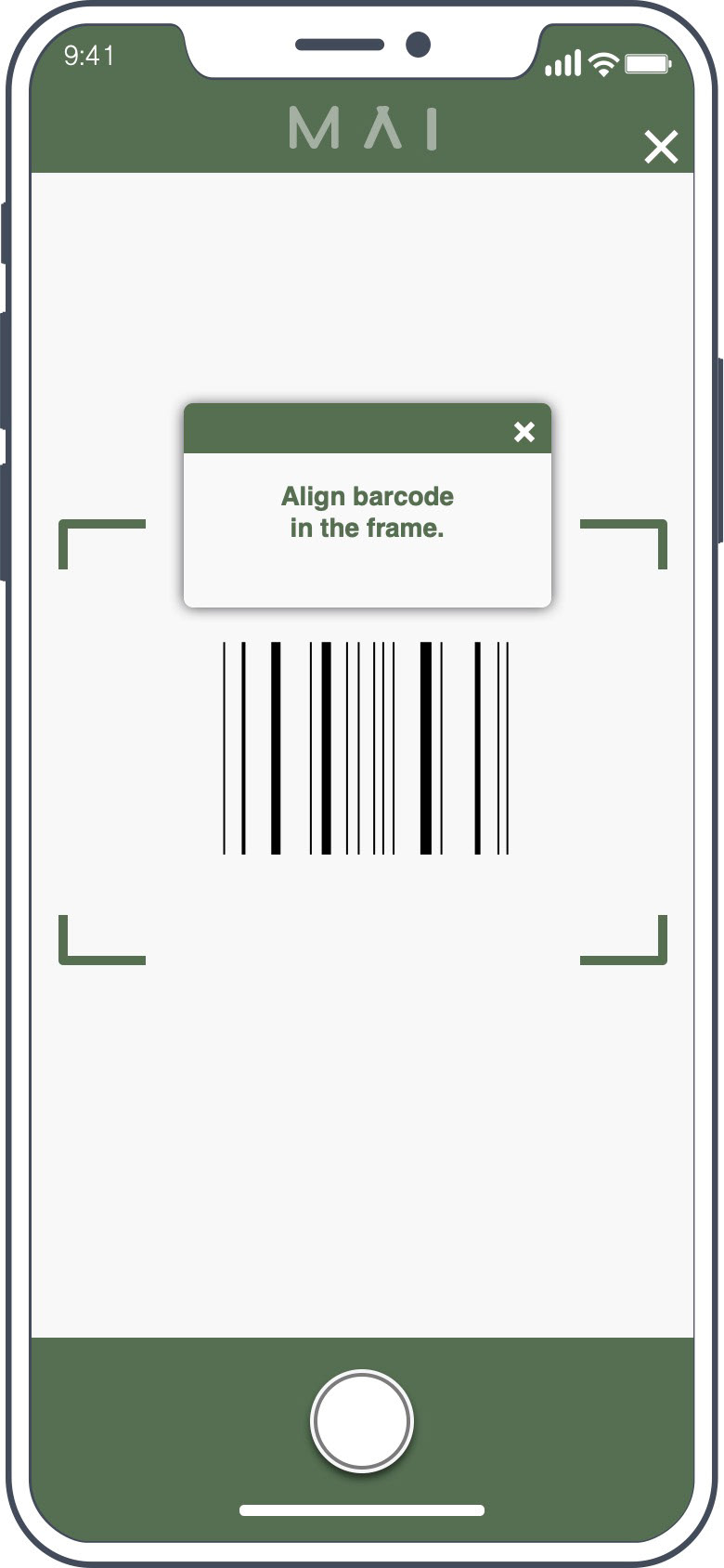
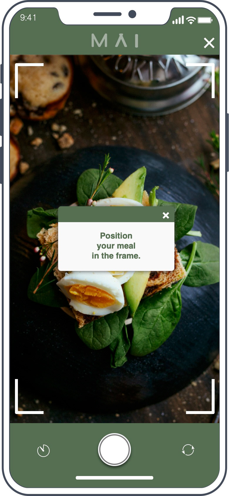
The feedback that I received was mainly centered on technical features. The lack of other features and technology currently caused some drawbacks during usability testing. MAI in theory uses advanced image recognition to be able to recognize and retrieve data instantaneously. It wasn’t until after I explained this to users that they understood the intent. I should have probably introduced that first.
Shifting focus from a social media platform to an educational resource
What I learned is that it is not entirely about getting a user hooked to your app. The initial reaction that I had in this problem space was to develop a platform where users will be on it every single day, for the rest of their lives. But in listening to the participants, I realize the use of these diet tracking apps is to create a strong healthy eating foundation then users “graduate” and move on.
Re-test with different questions
What I would have done differently is ask different test questions in the second round of testing. I think if I had done that, it would have challenged the design more and the design would have benefited more from user feedback. Also if I had introduced the app with the advanced technology (in theory), I think it would have decreased the concerns and uncertainties of participants.